IQSoft
OVERVIEW
IQSOFT is a Bulgarian software company specializing in ERP solutions and business process automation. The brief was to create a distinctive logo that reflects the company's technical expertise while communicating clarity, reliability, and innovation.
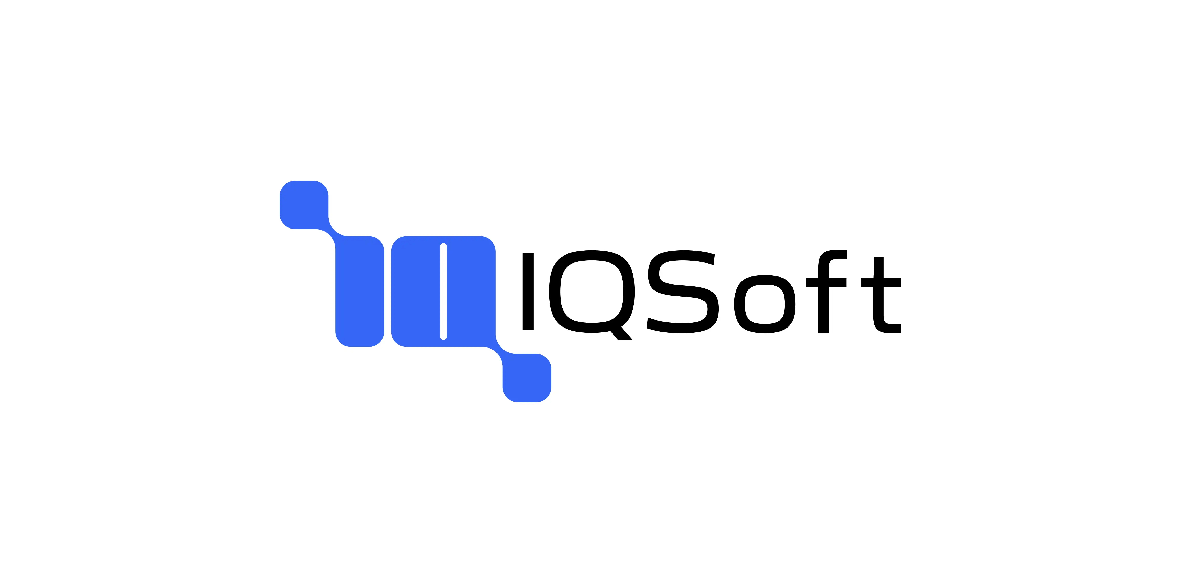
The final identity is built around a custom symbol that combines the company's initials with a visual representation of the connected systems at the core of every ERP platform.
CHALLENGE
ERP software simplifies complex business operations by connecting departments, data, and workflows into a single system. The challenge was to translate this idea into a simple and memorable logo without relying on the generic visual language commonly found in technology branding.
The solution focused on creating a symbol that communicates both the company's name and the underlying principles behind its software.



IDENTITY CONCEPT
The icon merges the letters I and Q into a single geometric mark. Beyond the initials themselves, the circular terminals of both letters function as connected nodes, referencing the way an ERP system links different parts of a business into one integrated platform.
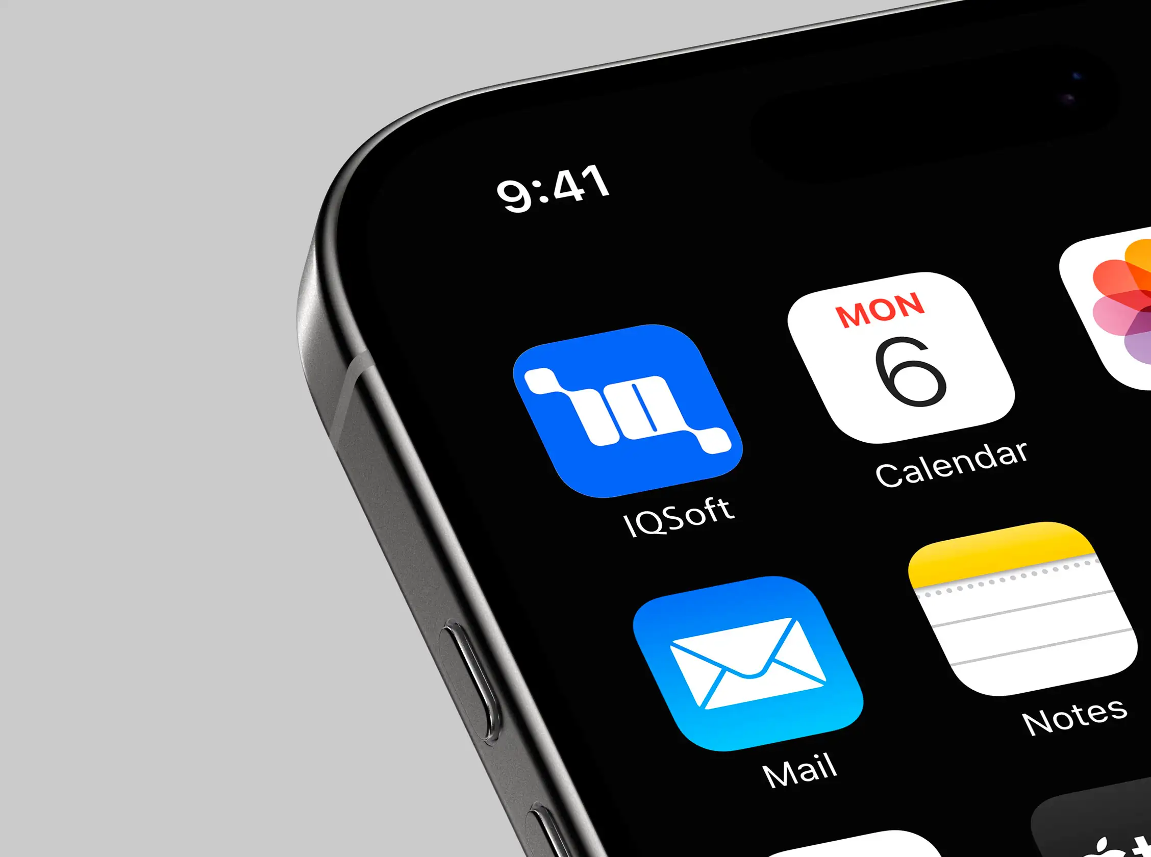
The symbol is deliberately minimal, allowing it to remain clear and recognizable at any size while expressing ideas of connectivity, structure, and efficiency through its construction.
The final identity emerged through an iterative design process exploring multiple directions before refining the concept into its simplest and most distinctive form. Early explorations tested different relationships between the initials, geometry, and visual balance, helping identify the solution that best communicated both the company's name and the concept of interconnected systems.
By reducing the mark to its essential elements, the final logo achieves a balance between technical precision and memorability.

IMPACT
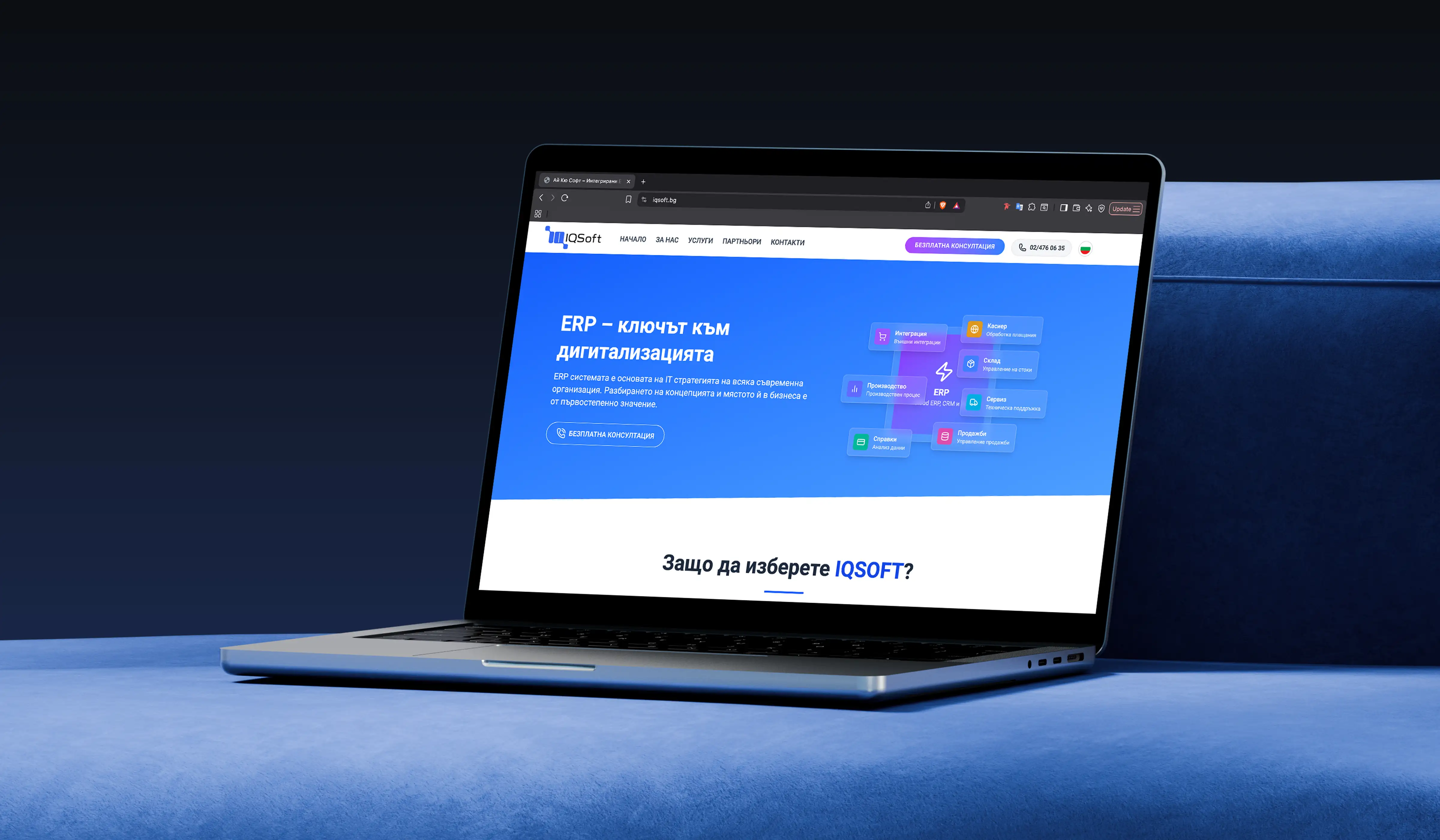
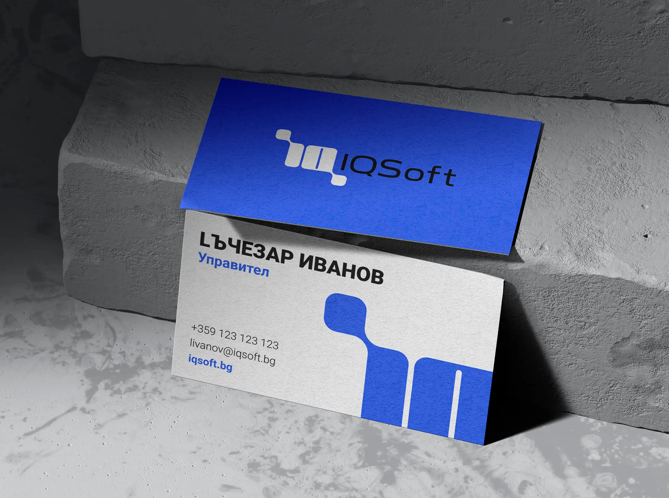
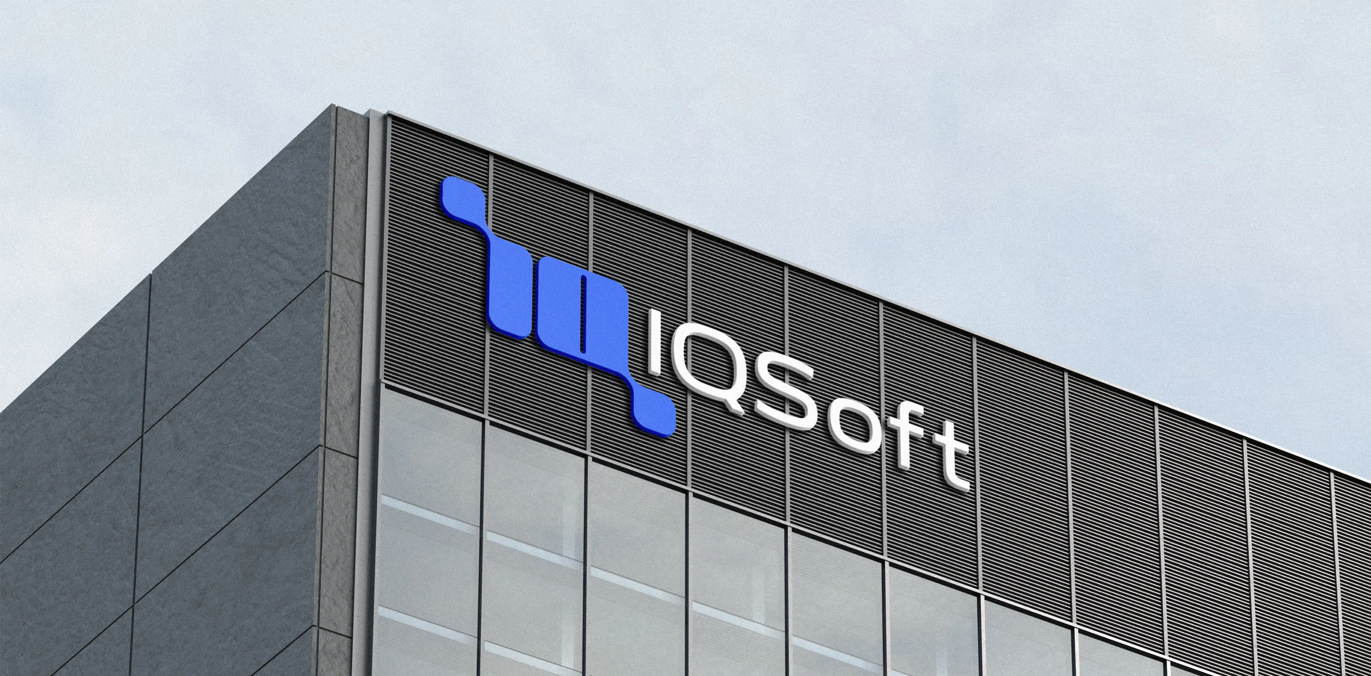
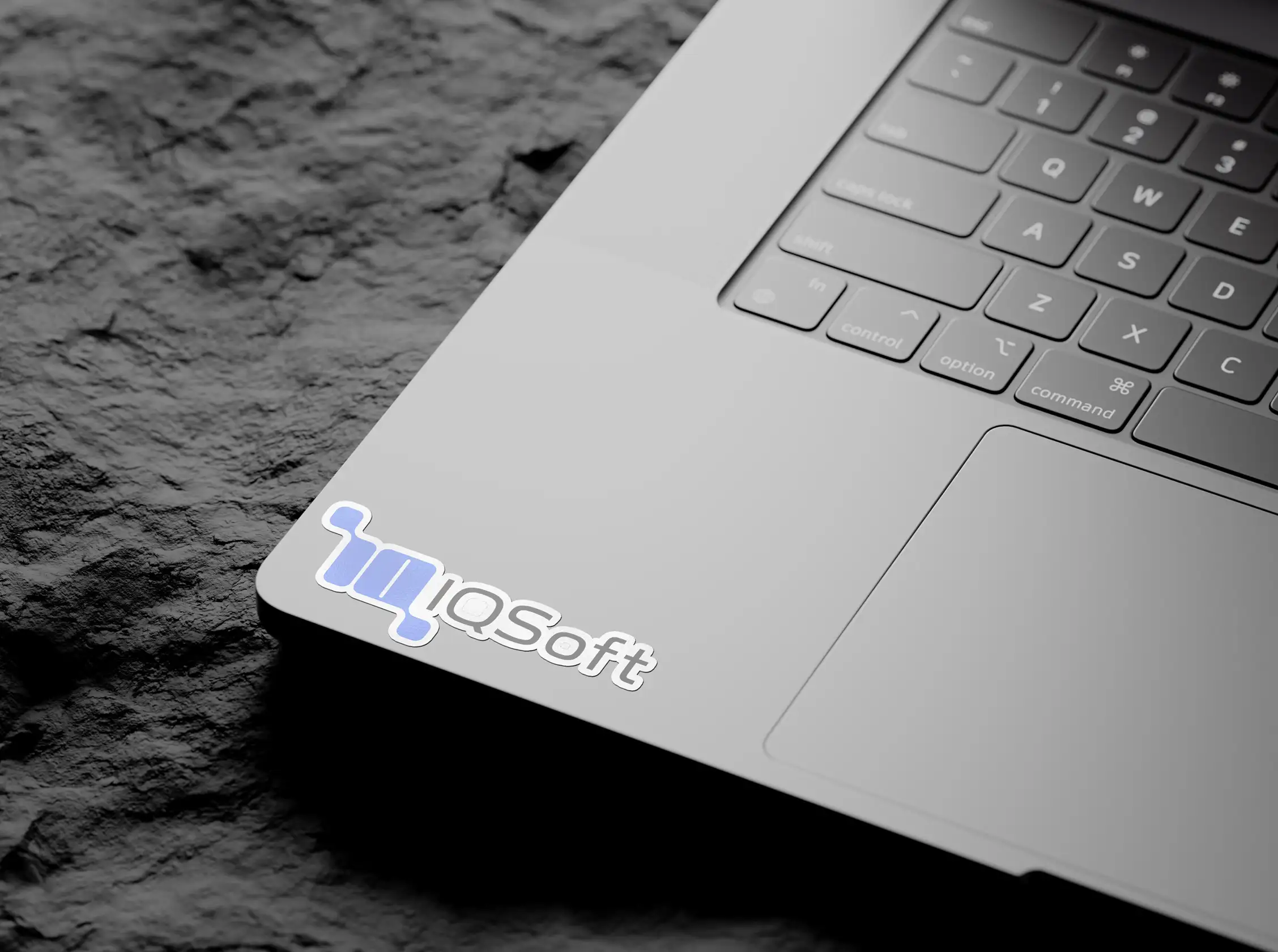
Designed with versatility in mind, the logo performs consistently across digital products, corporate presentations, printed materials, and marketing applications. Its simple geometric construction ensures clarity at both large and small scales while providing IQSOFT with a strong and recognizable visual signature.
The result is a modern and timeless identity that reflects IQSOFT's expertise in ERP software while communicating one of its core values: connecting complex business processes through intelligent technology. By combining symbolic meaning with functional simplicity, the logo establishes a clear visual foundation that can support the company's growth across digital and physical touchpoints.