Josef P
OVERVIEW
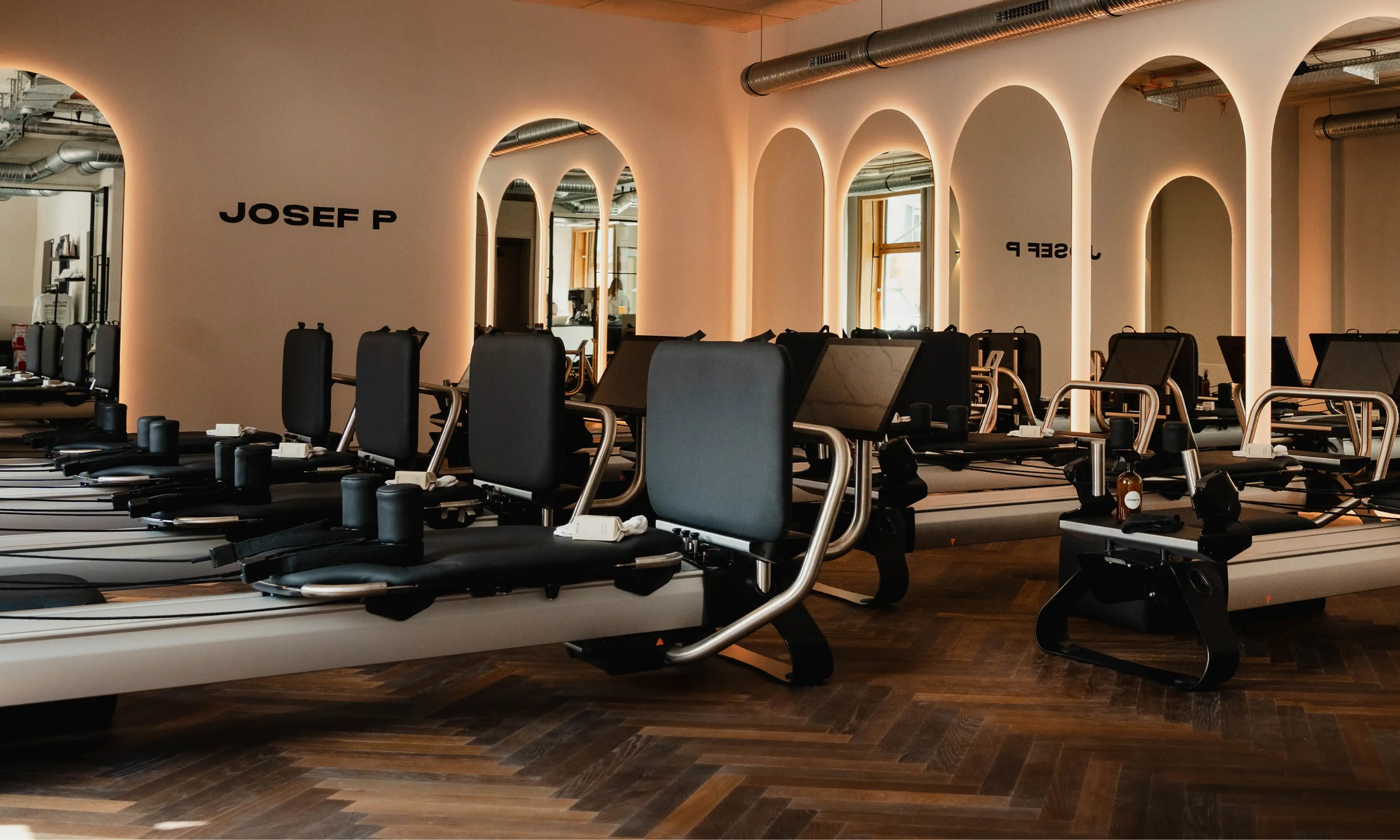
JOSEF P is a contemporary Pilates brand built around the idea that movement extends beyond the studio. Combining Pilates, specialty coffee, nutritious food, and apparel under one identity, the brand creates a lifestyle centered on wellbeing, community, and conscious living.
The project involved developing a complete visual identity and scalable brand system capable of supporting multiple sub-brands while maintaining a consistent and recognizable presence.
CHALLENGE & STRATEGY
The ambition behind JOSEF P extended far beyond creating another Pilates studio. The challenge was to build a flexible identity capable of bringing together movement, hospitality, retail, and future brand extensions without losing clarity or cohesion.
The strategy focused on creating a master brand supported by a modular identity system. Rather than giving each offering its own separate identity, every sub-brand becomes part of a larger visual family, allowing the business to grow while maintaining strong brand recognition.

IDENTITY SYSTEM
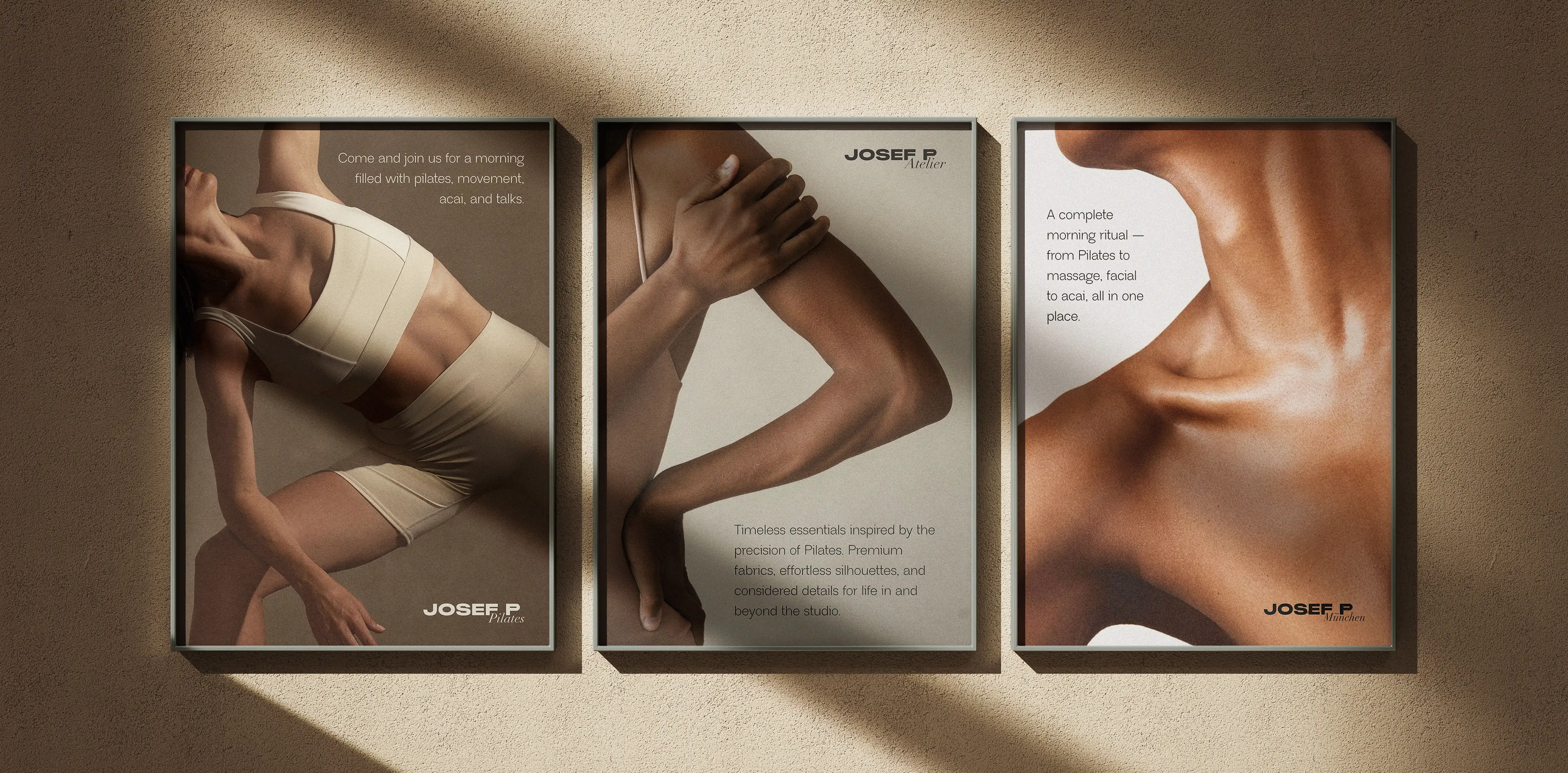
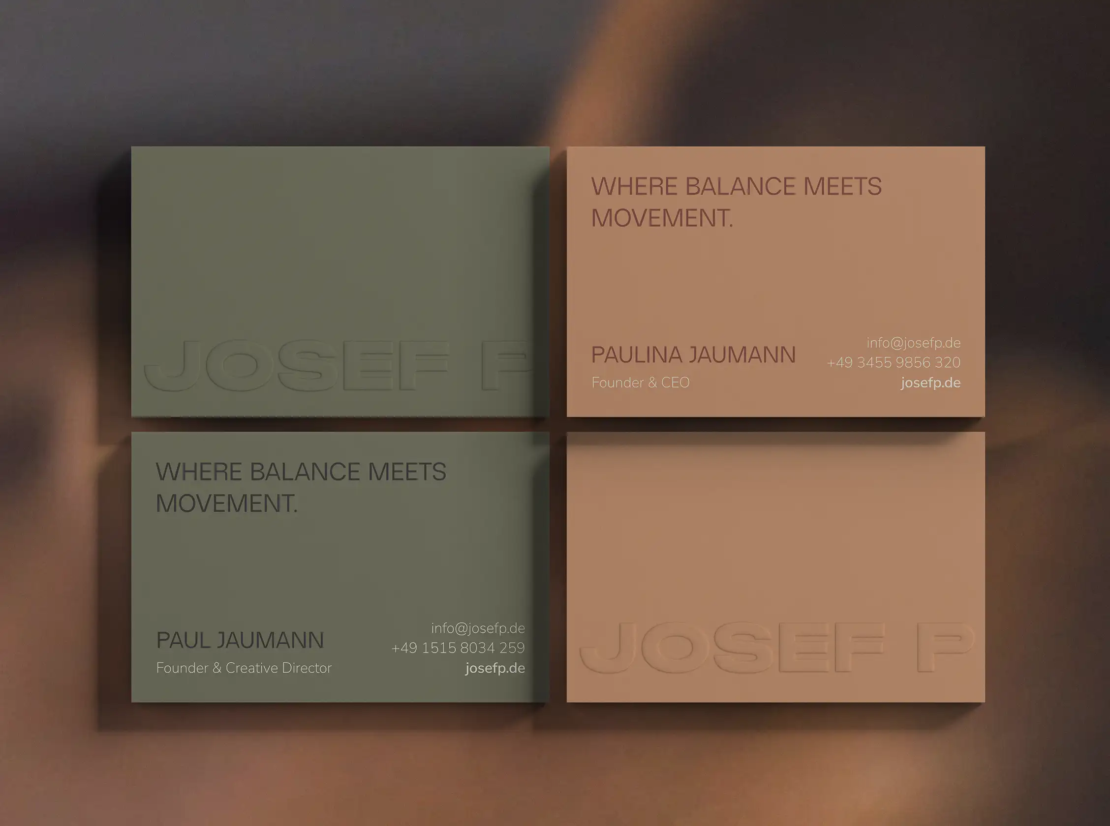
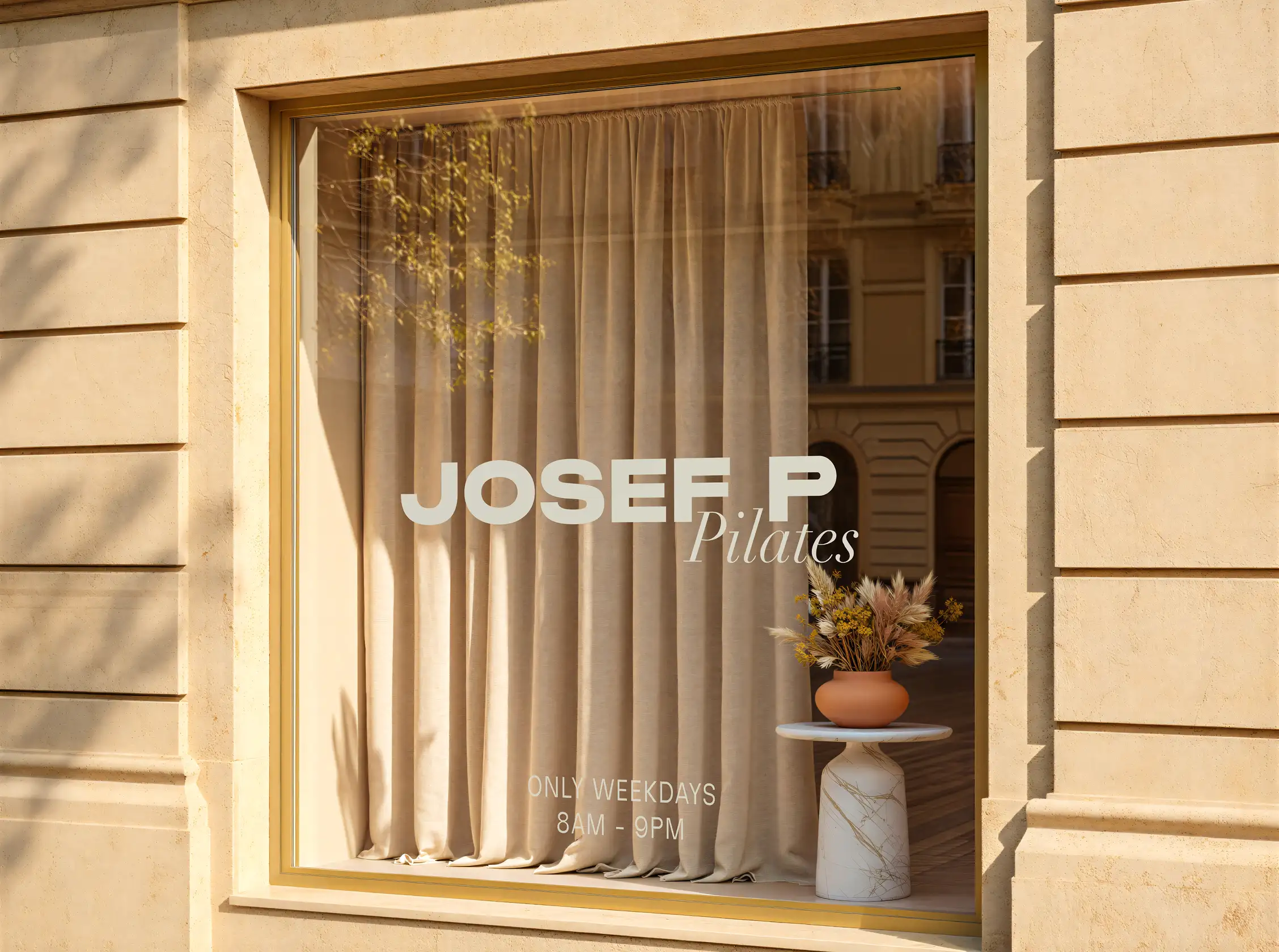
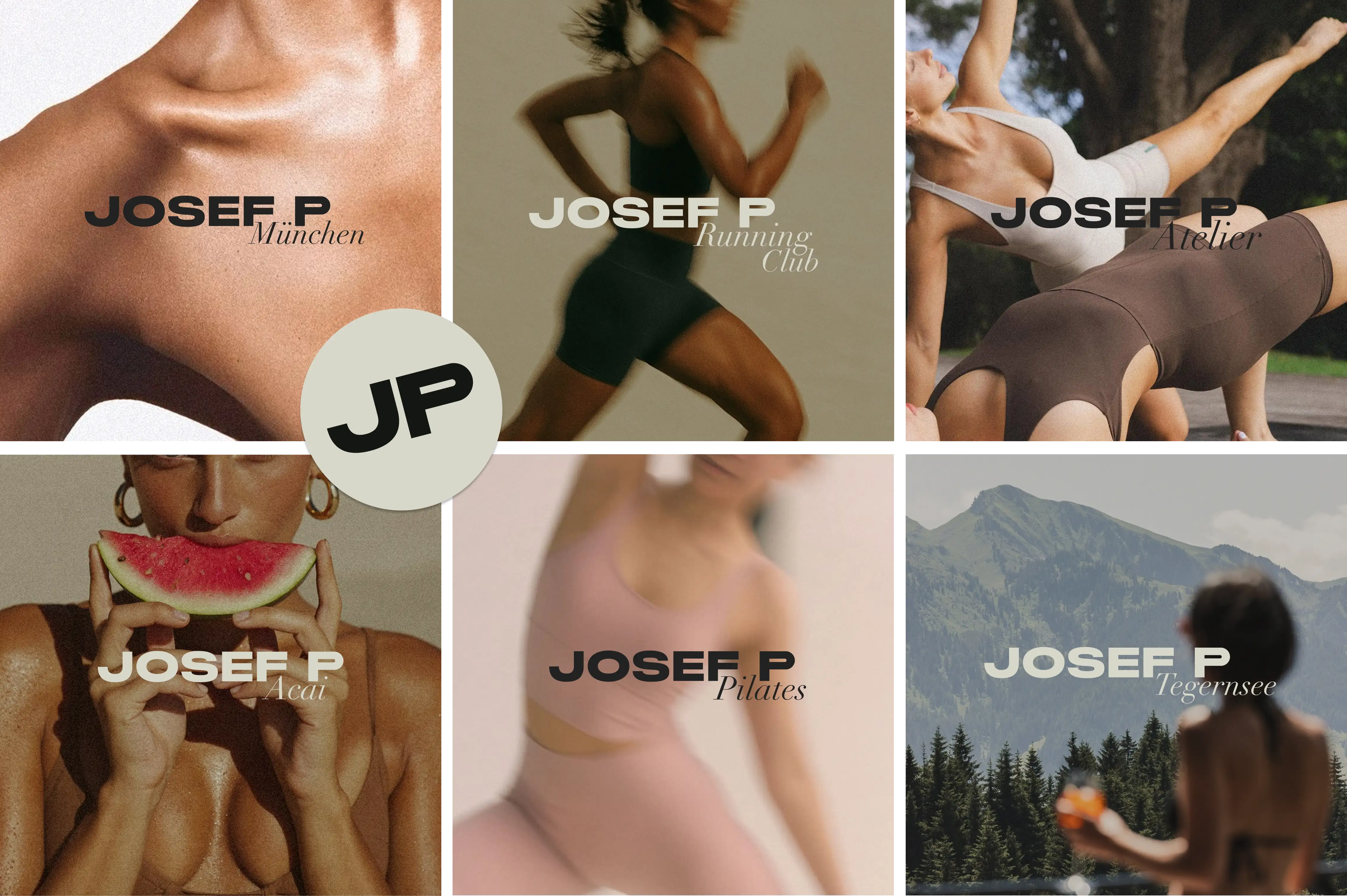
At the core of the identity is a bold custom wordmark that reflects the confidence and simplicity of the brand. Supporting logos introduce individual sub-brands such as Pilates and Acai through an elegant italic serif, creating subtle differentiation while preserving a unified identity.
A standalone monogram extends the system across smaller applications, providing a recognizable brand mark that remains effective across digital and physical environments.


BRAND EXTENSIONS
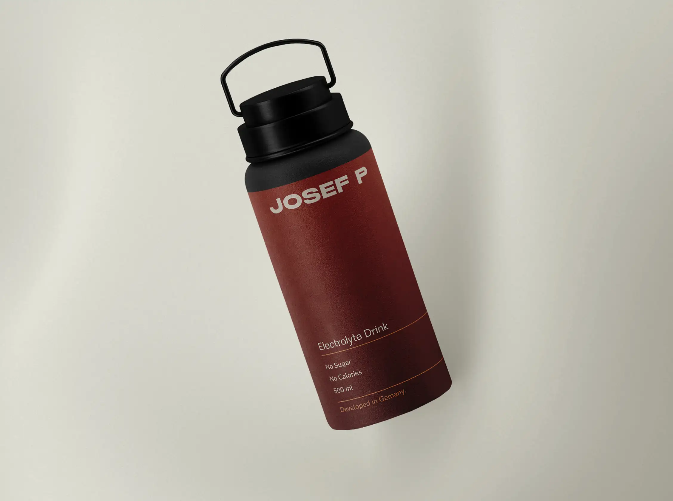
The identity was designed as a scalable system capable of supporting every aspect of the JOSEF P experience. From cafés and apparel to takeaway packaging, signage, and studio environments, each application reinforces the same visual language while adapting naturally to its specific context.
This flexibility allows new products and future locations to integrate seamlessly into the brand without requiring entirely new identities.

VISUAL SYSTEM
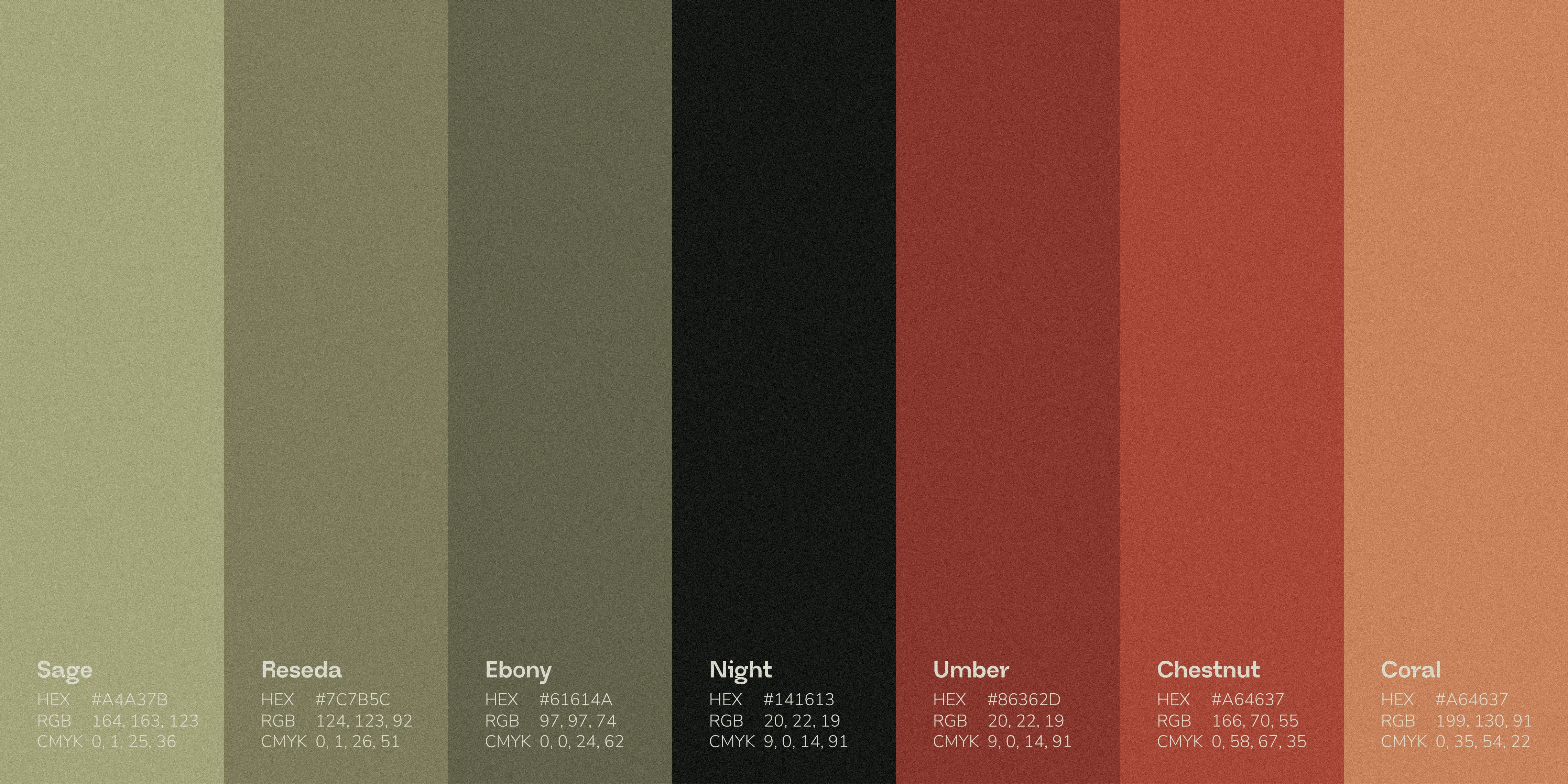
The visual language combines contemporary typography with earthy colour palettes that distinguish the different areas of the brand while maintaining overall consistency. Deep greens communicate calmness and focus within the Pilates experience, while warmer reds introduce energy and vitality for the café and Acai offerings.
Complementing the identity is a family of custom patterns developed by deconstructing the JOSEF P wordmark into modular graphic elements. These patterns introduce texture, rhythm, and recognizability across packaging, apparel, and environmental graphics, extending the identity beyond the logo itself.
IMPACT
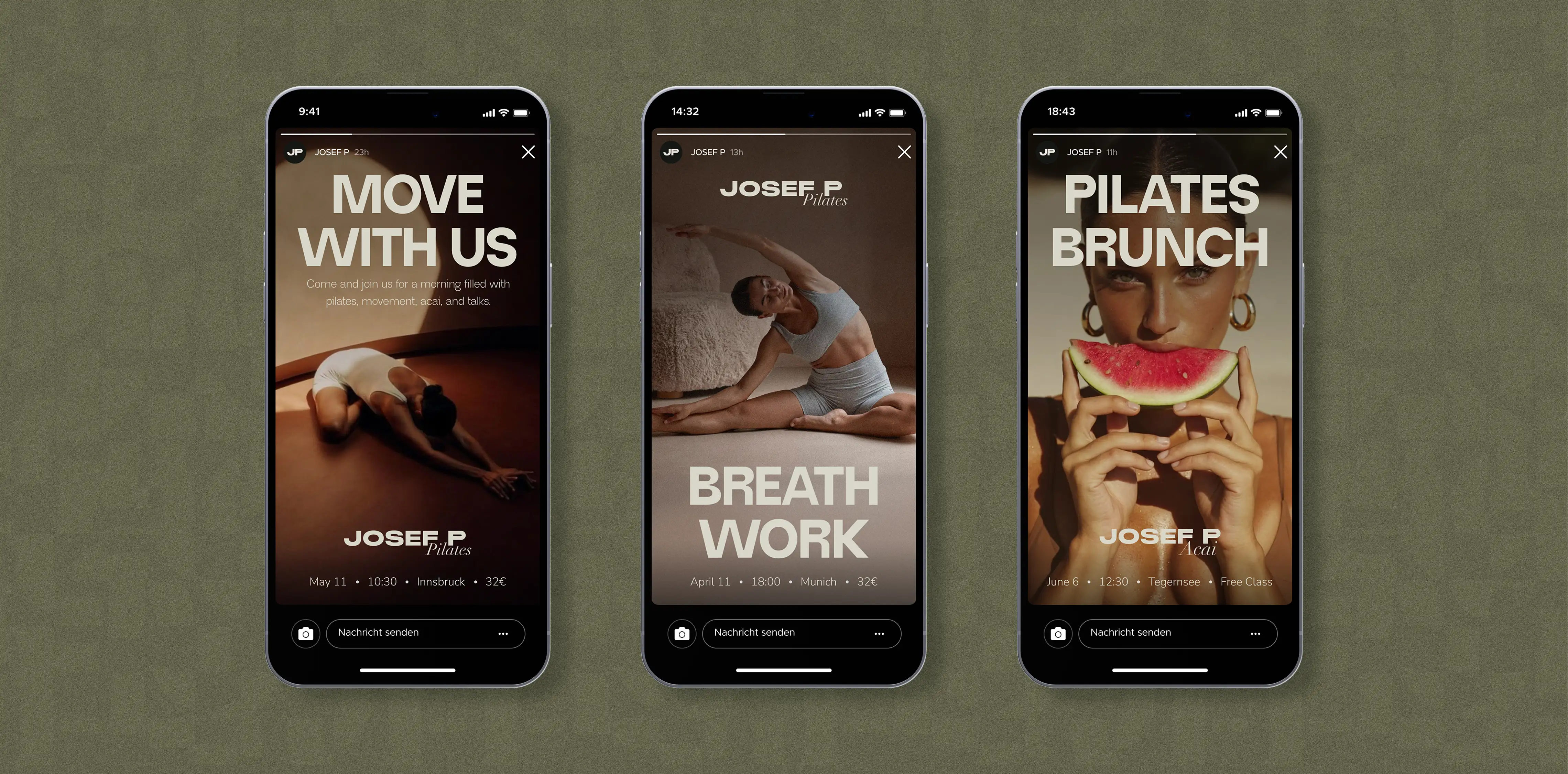
The result is a scalable identity designed to grow alongside the business. Built as a flexible brand system rather than a standalone logo, it supports new studios, products, and future brand extensions while maintaining a consistent visual language. Since its launch, JOSEF P has expanded to six locations across Germany, Austria, and Spain, reinforcing the role of the identity as a foundation for the brand's continued growth.