NIS
OVERVIEW
Nadezda Invest Stroy (NIS) is a Bulgarian construction company specializing in residential and commercial development. The brief was to create a distinctive logo that reflected the company's reliability and technical expertise while remaining simple, memorable, and highly adaptable across both digital and physical applications.
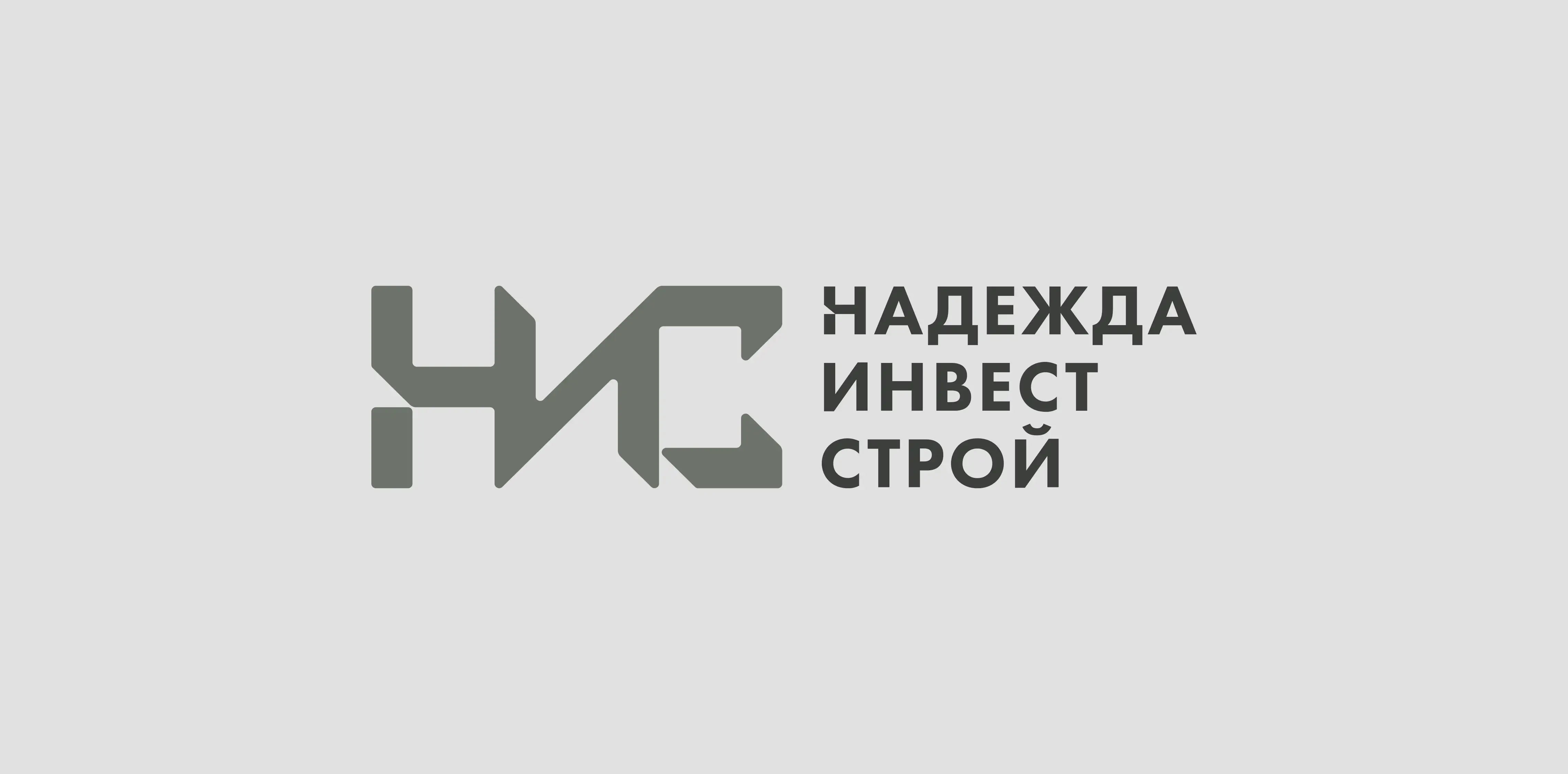
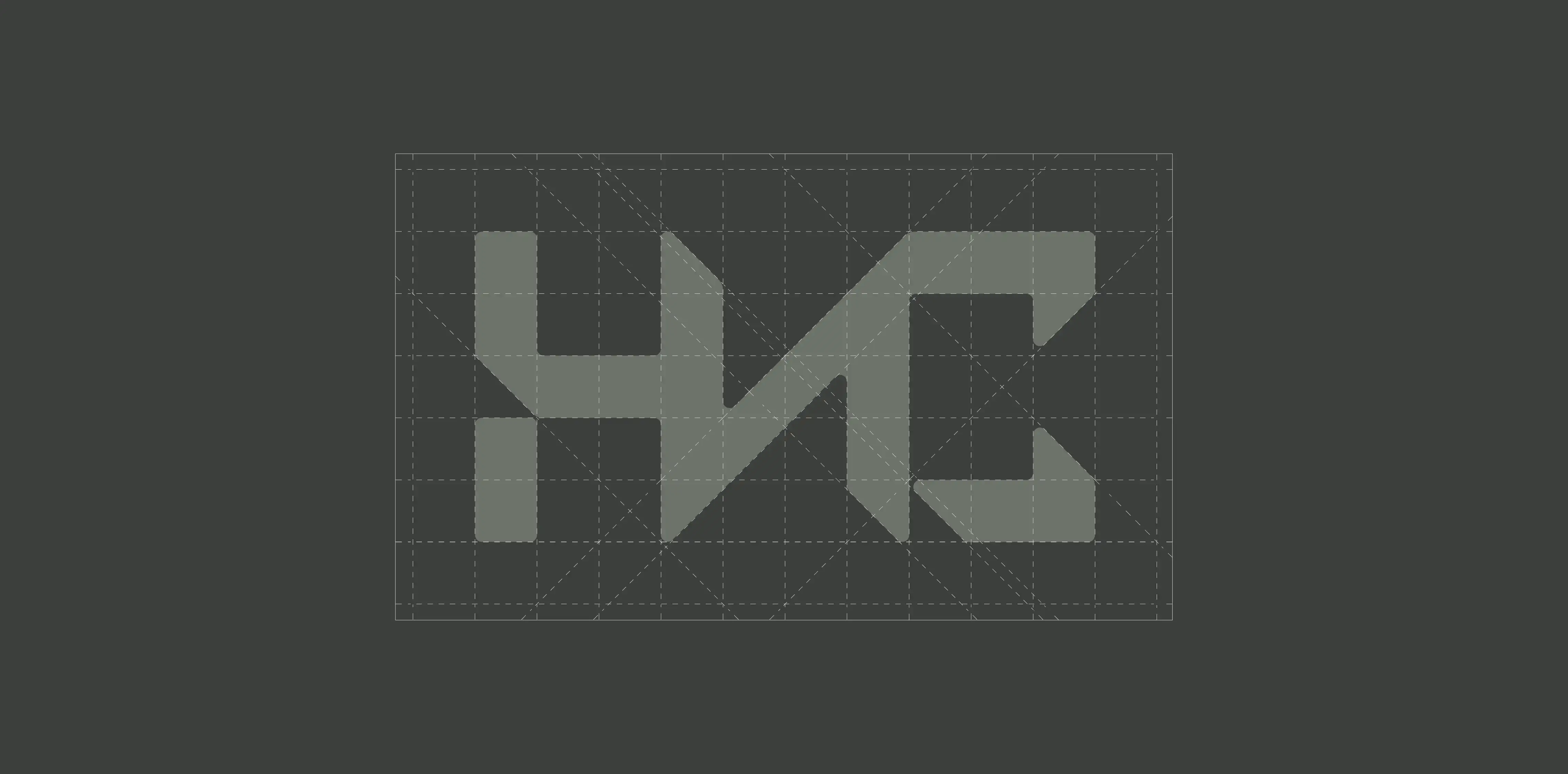
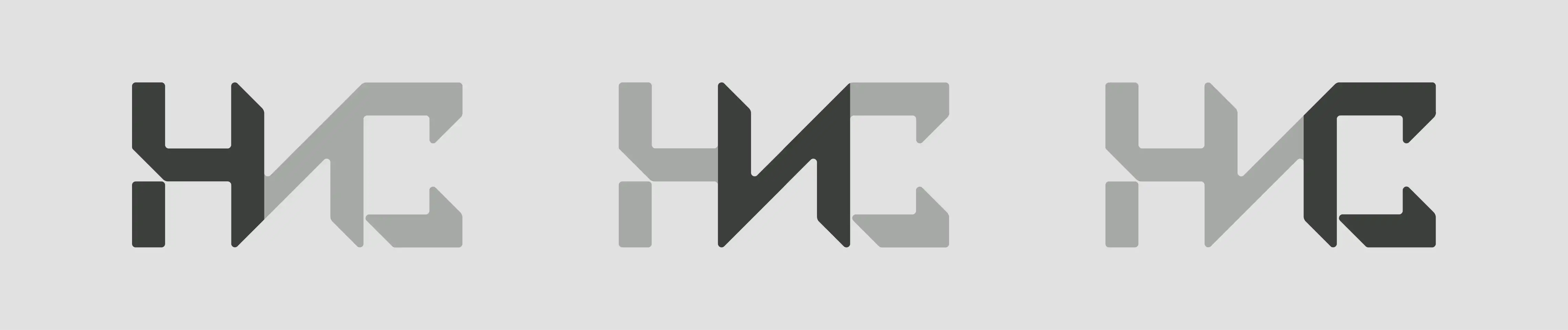
The final identity is built around a custom monogram that transforms the company's Bulgarian initials into a single geometric symbol, creating a recognizable mark without relying on conventional construction imagery.
CHALLENGE
Many construction companies share a similar visual language, making it difficult to establish a distinctive identity while maintaining professionalism. The challenge was to design a logo that communicated stability and precision without resorting to predictable symbols such as buildings, roofs, or construction tools.
The solution focused on abstraction rather than illustration, creating an identity that is both timeless and immediately associated with the company's name.
IDENTITY CONCEPT
The symbol is constructed by merging the Bulgarian initials Н, И, and С into a single geometric form. Rather than reading as three separate letters, the mark functions as one cohesive symbol while subtly revealing each character through its structure.
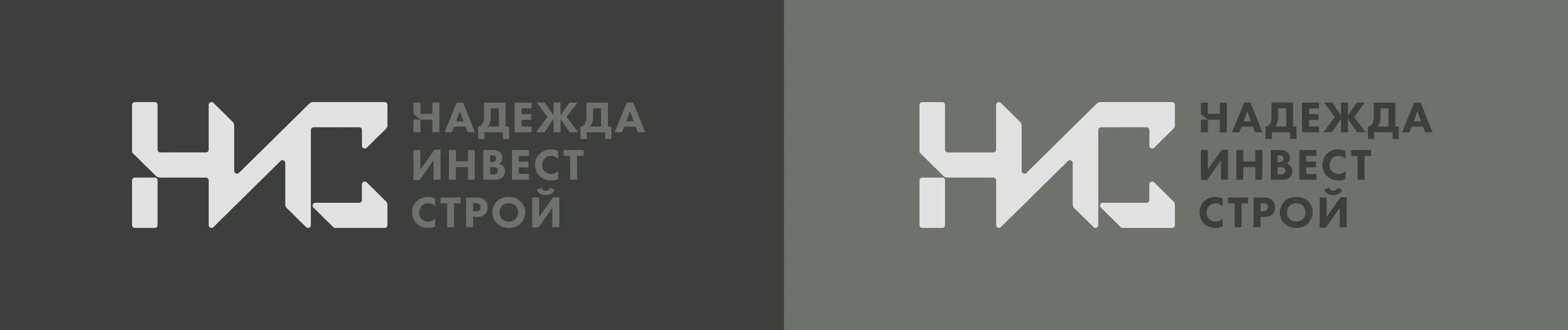
To balance the visual weight of the icon, the accompanying wordmark uses a heavier type weight, creating a stable and confident composition. Together, the symbol and typography form a clear identity that remains legible across a wide range of sizes and applications.
IMPACT
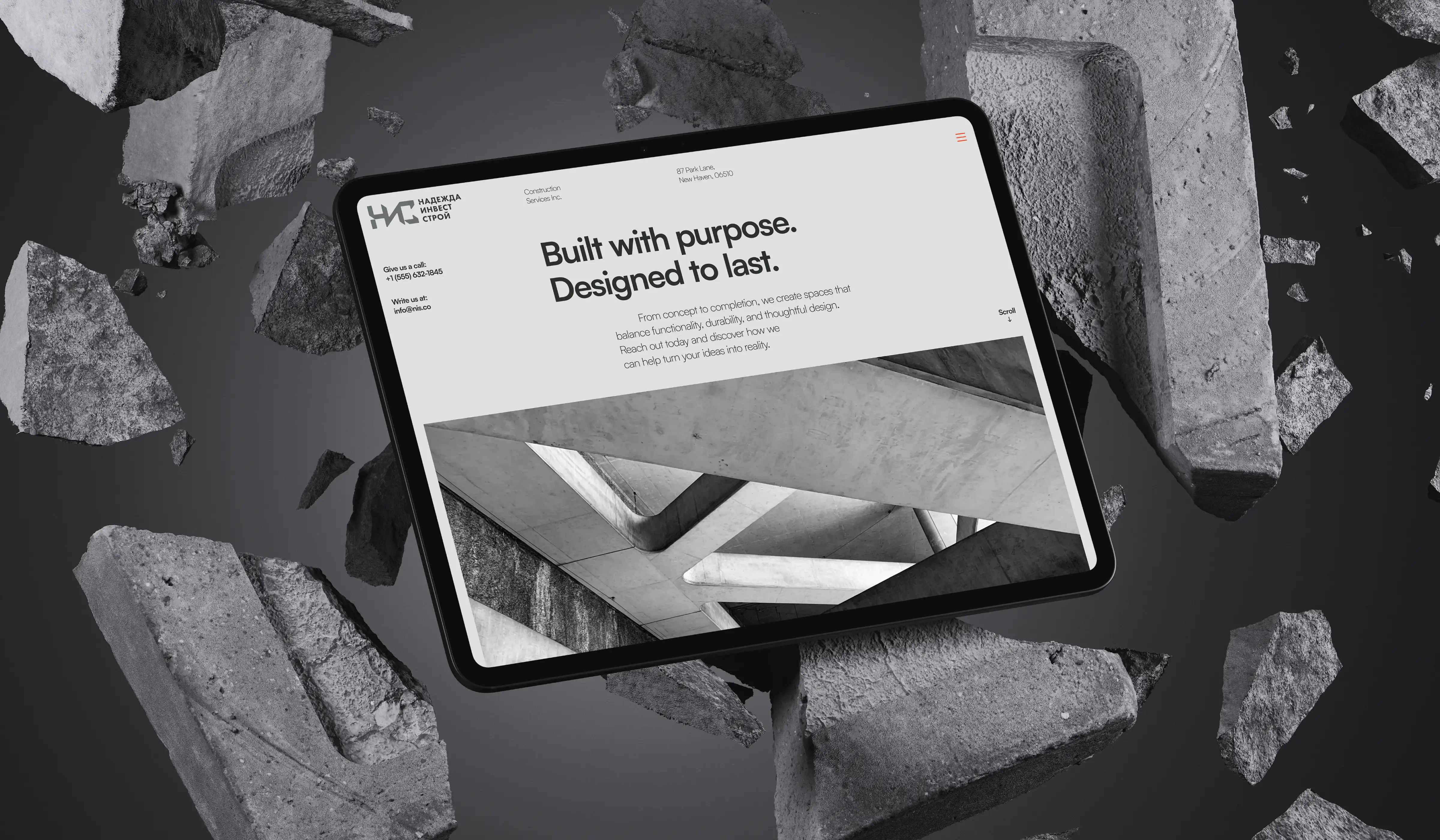
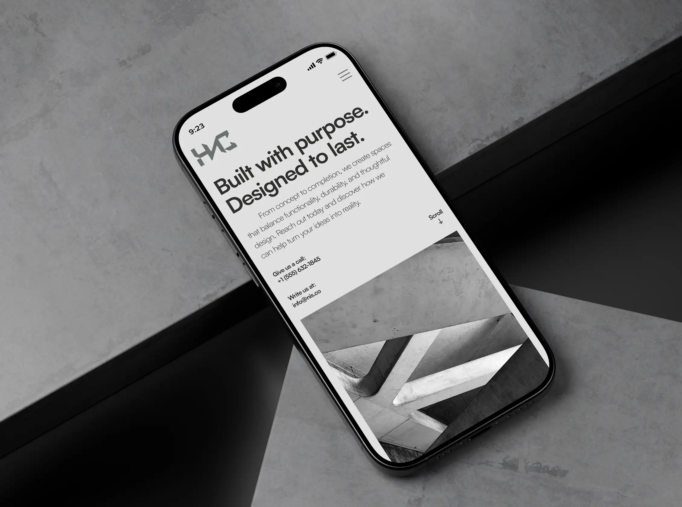
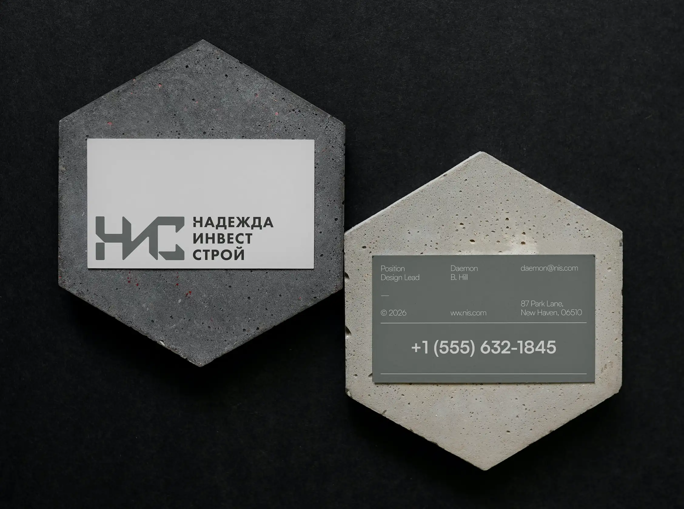
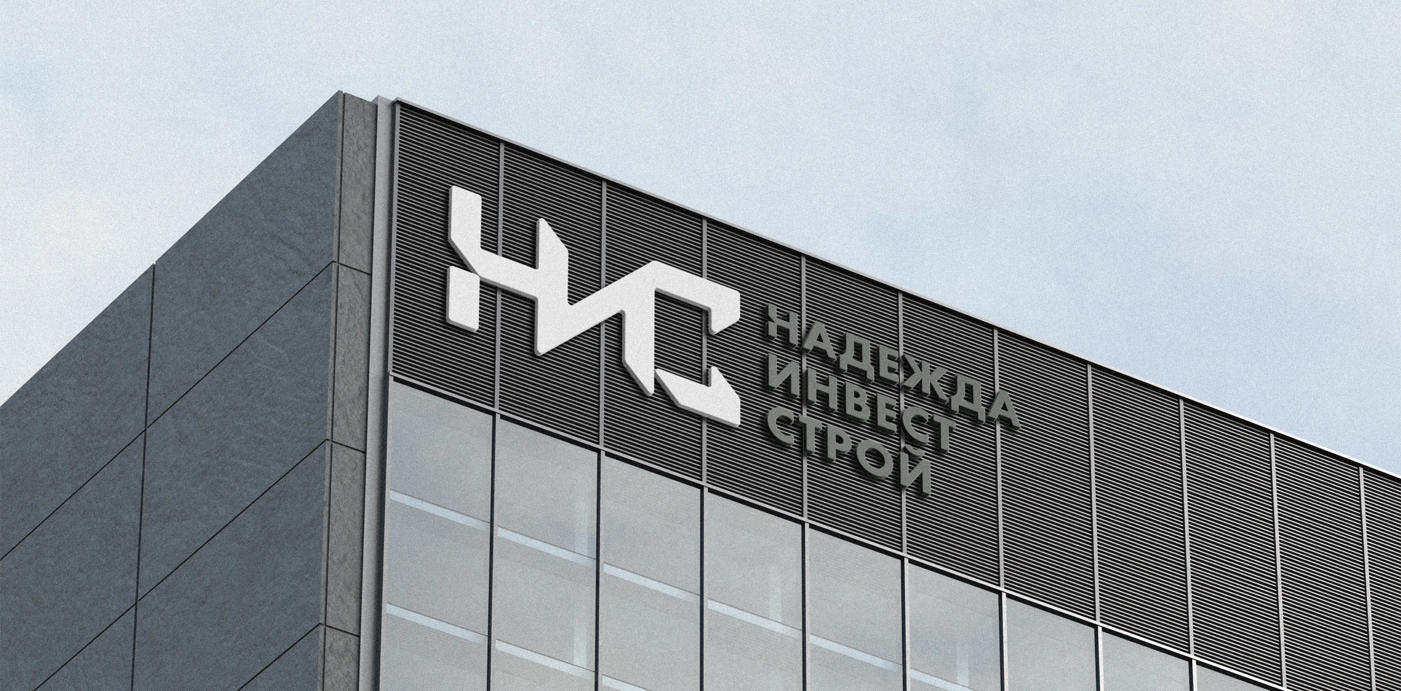
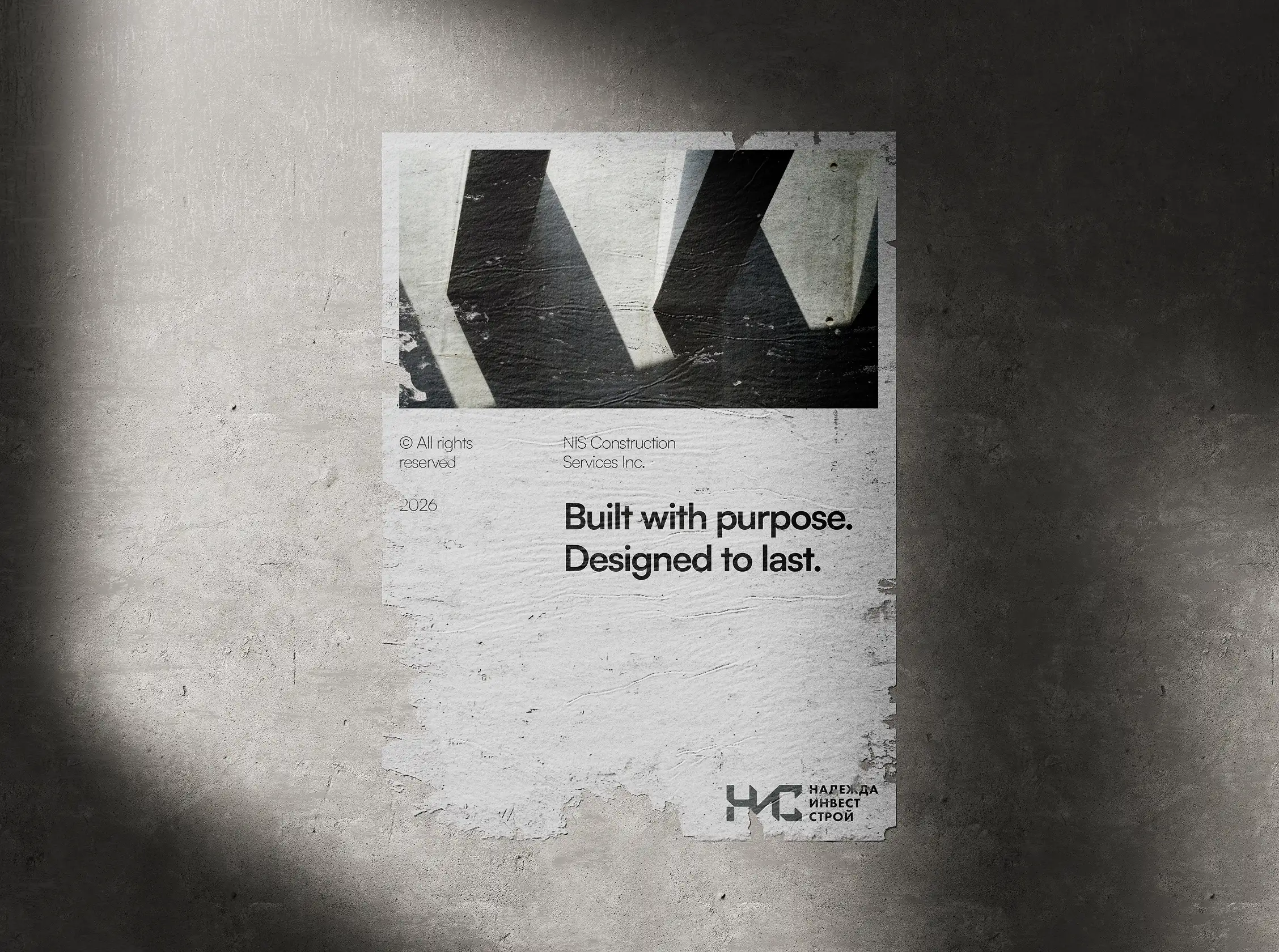
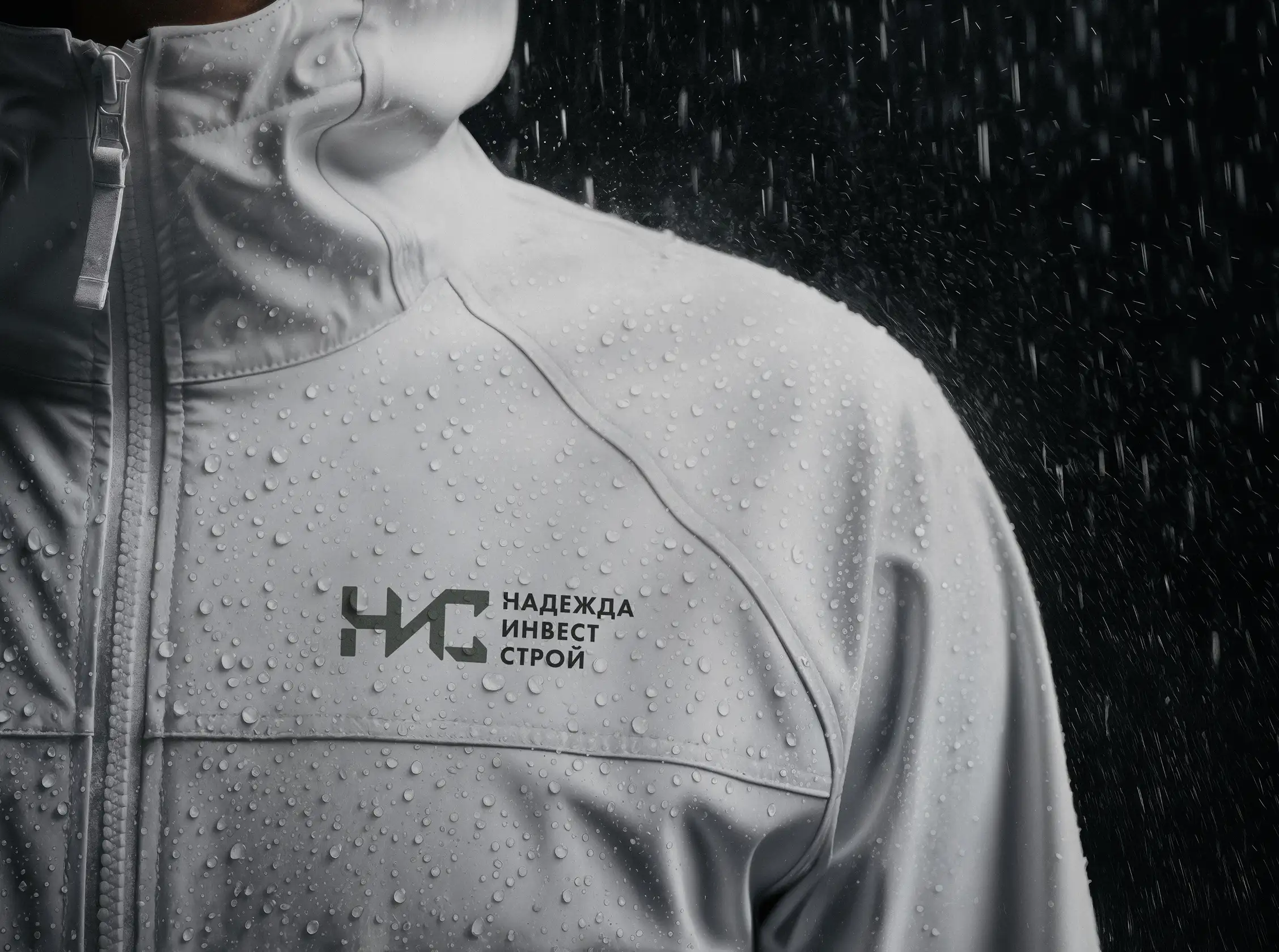
The simplicity of the mark allows it to perform consistently across signage, printed materials, workwear, business stationery, and digital environments. Its geometric construction ensures clarity at both large and small scales while giving the company a distinctive visual signature.
The result is a timeless identity that provides NIS with a recognizable visual foundation built around its own initials. By reducing the company's name to a single memorable symbol, the identity establishes strong brand recognition while remaining practical, scalable, and easy to reproduce across every touchpoint.