SiFly
Overview
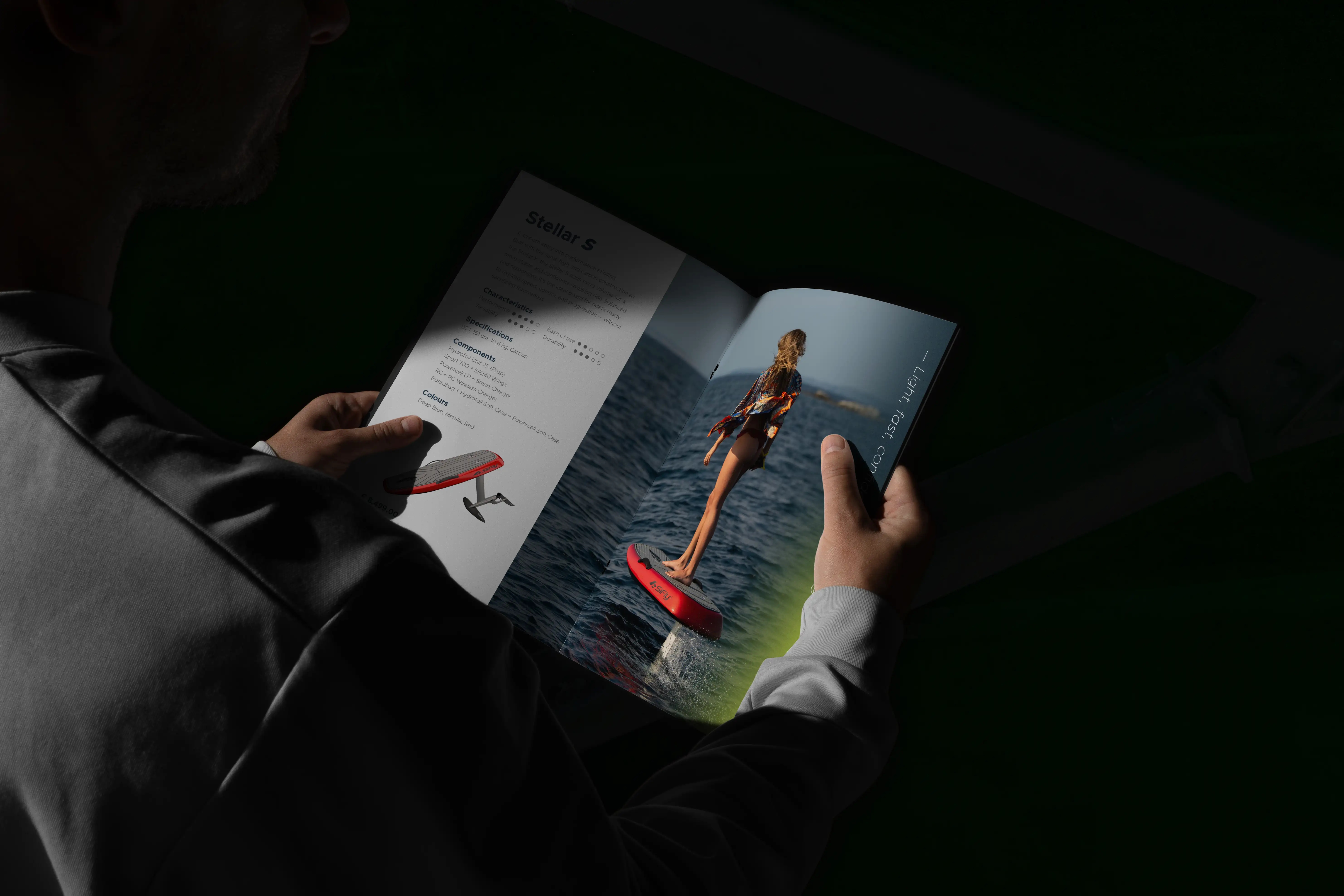
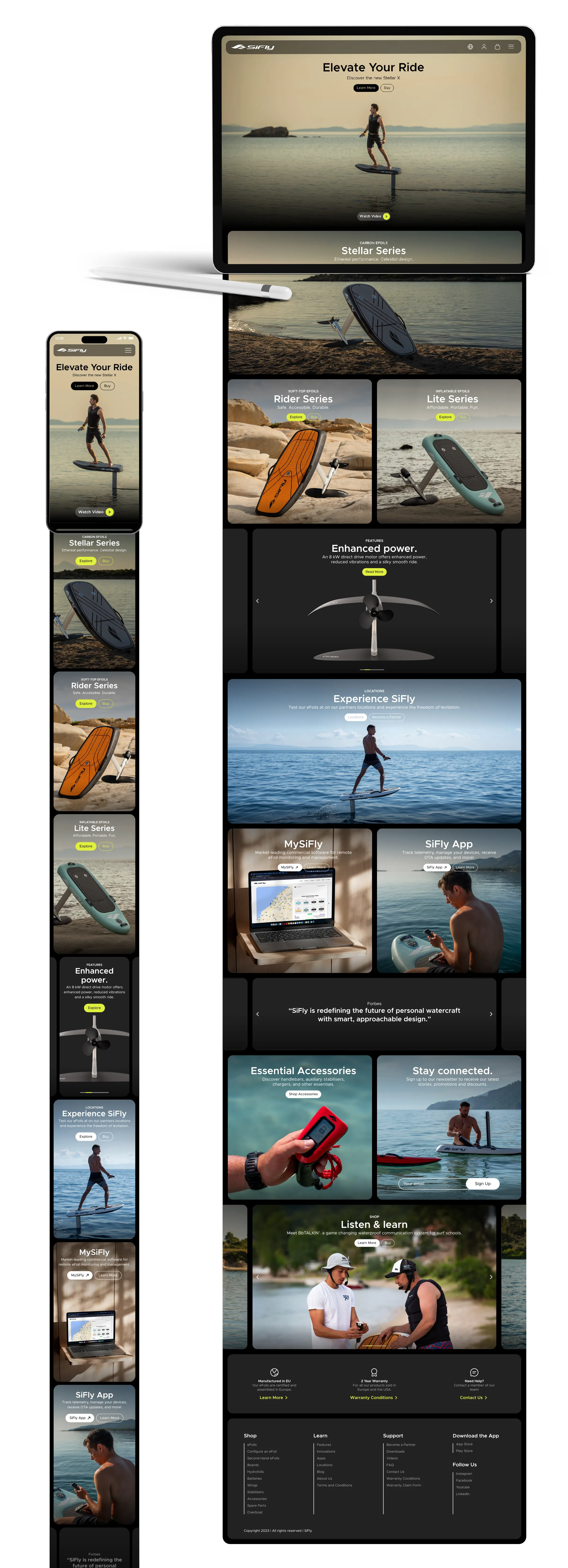
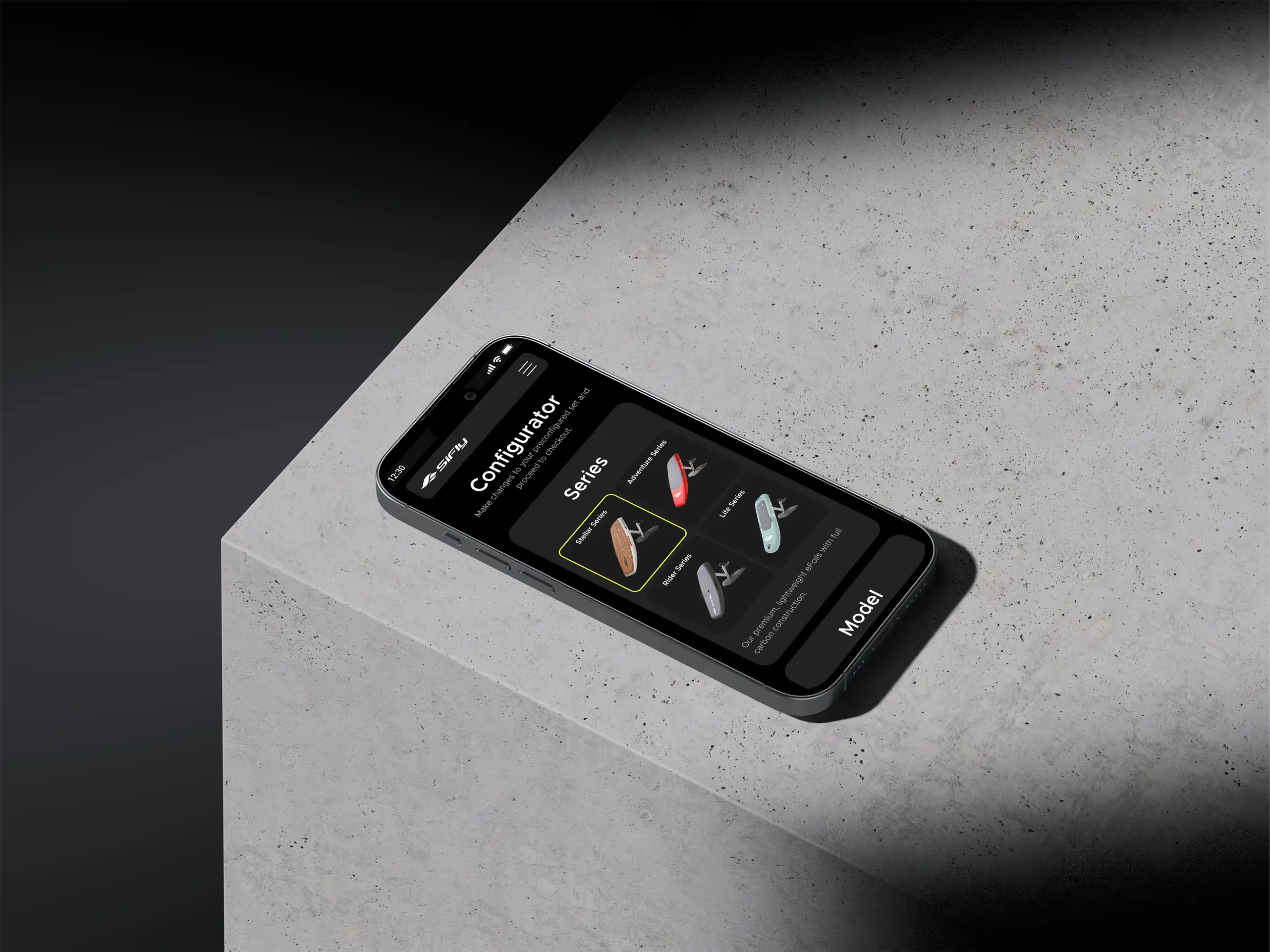
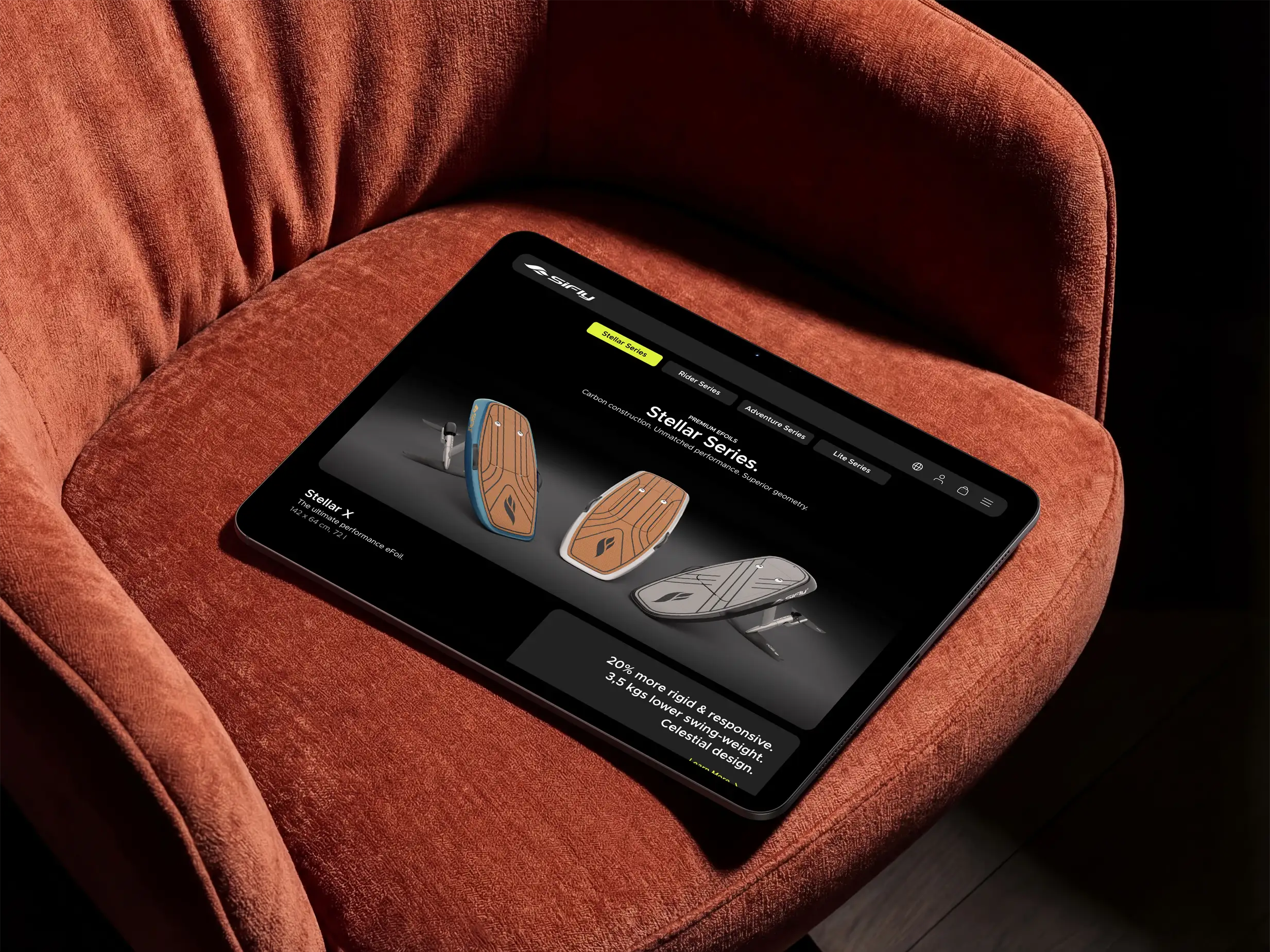
Over the past three years, I have worked closely with SiFly, leading the development of its brand, digital presence, and product experience. My role spanned brand identity, website design, interface design, and supporting visual systems, helping establish a cohesive brand across digital, physical, and product touchpoints.
Challange & Strategy
SiFly engineers high-performance electric hydrofoils, but the digital experience did not fully reflect the quality of the product itself. The challenge was to create a platform that communicated performance, innovation, and ease of use while supporting the company's growing product ecosystem.
The solution combined immersive visual storytelling with a flexible design framework, creating a digital experience that balances technical credibility with accessibility. By focusing on the brand's core values — Progressive Performance, Purposeful Impact, and Limitless Freedom — the platform was designed to engage both first-time riders and experienced enthusiasts.
Product Interface
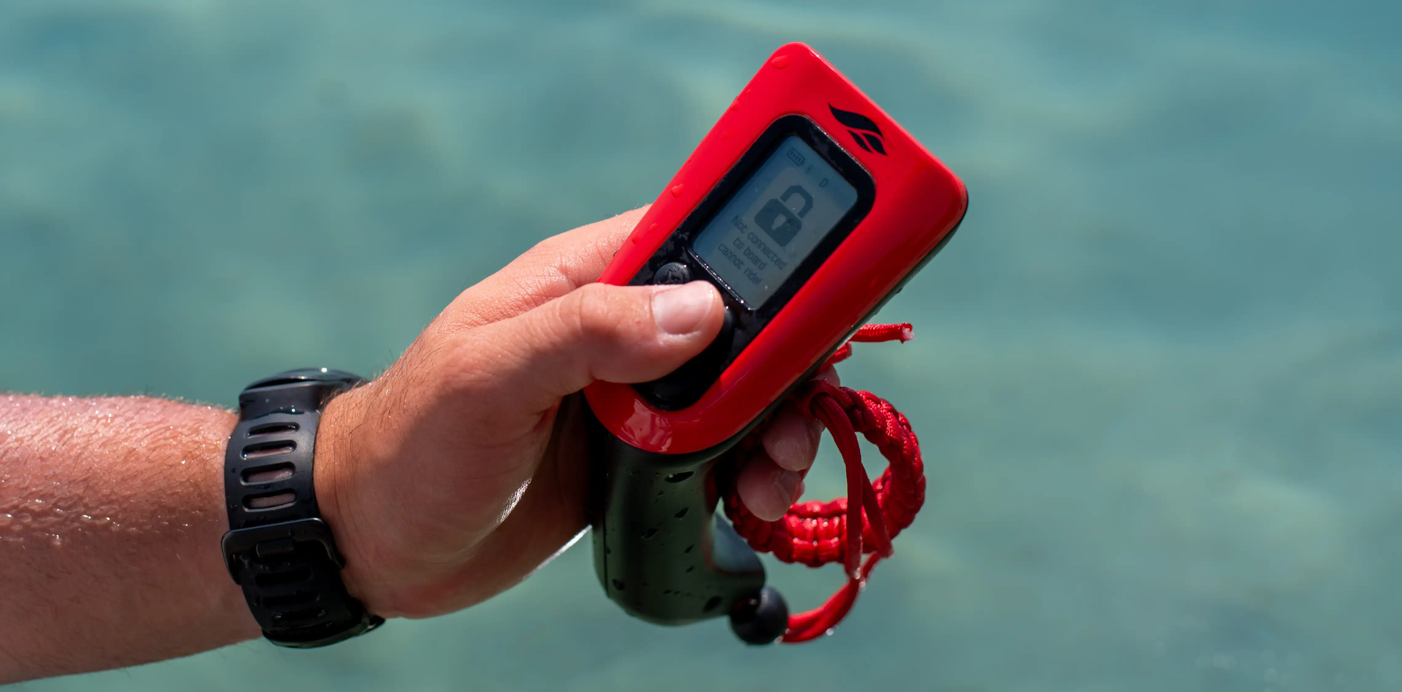
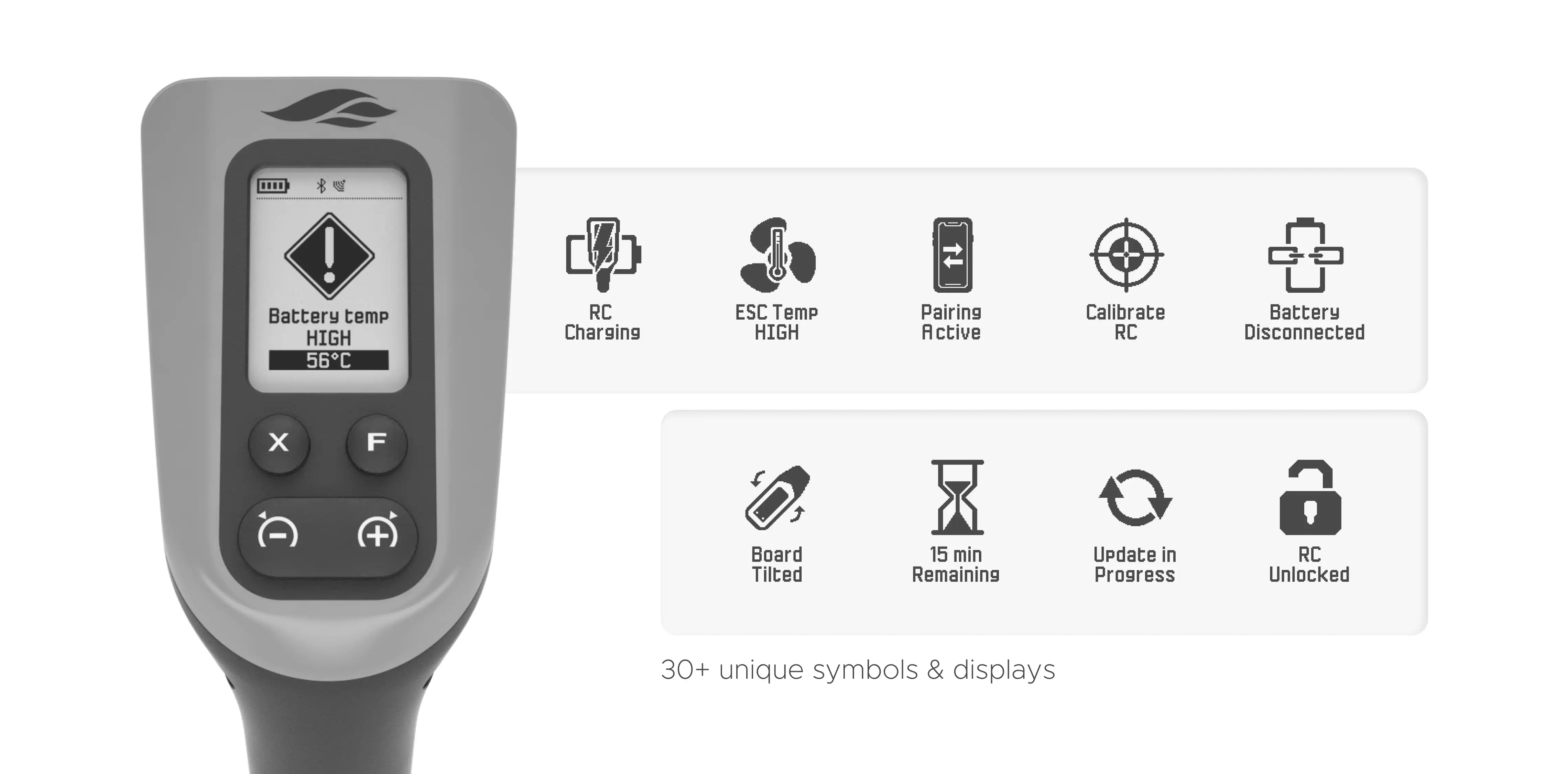
A defining part of the project was the design of the remote control interface used while riding.
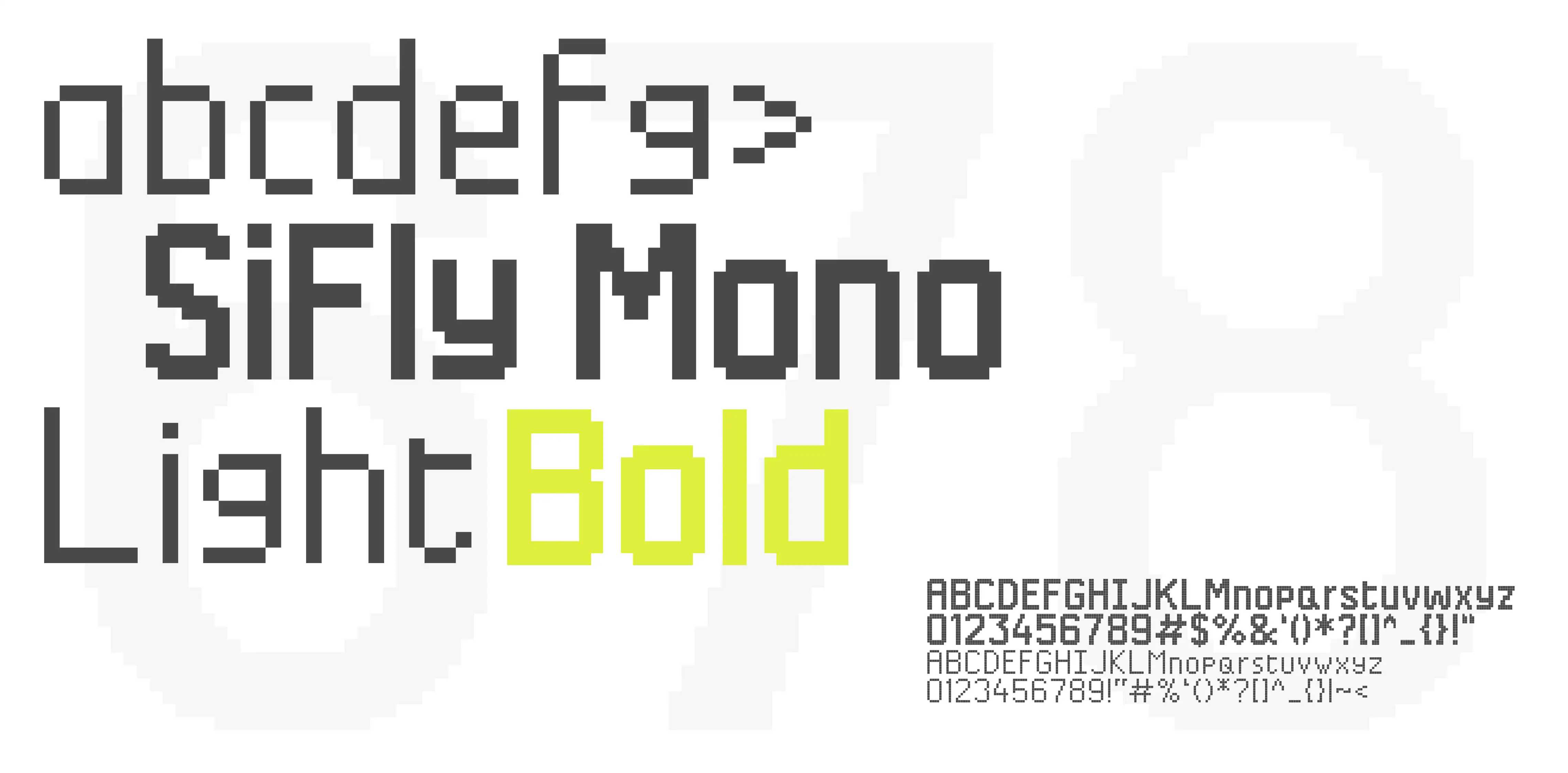
The original hardware relied on a 1-bit display, imposing strict limitations on visual output and requiring a highly disciplined approach to information hierarchy. Every screen was reduced to its essential elements, using contrast, scale, and spacing to ensure readability in dynamic conditions.
The result was a robust interface system optimized for quick decision-making, allowing riders to access critical information at a glance without distraction.
Illustrations
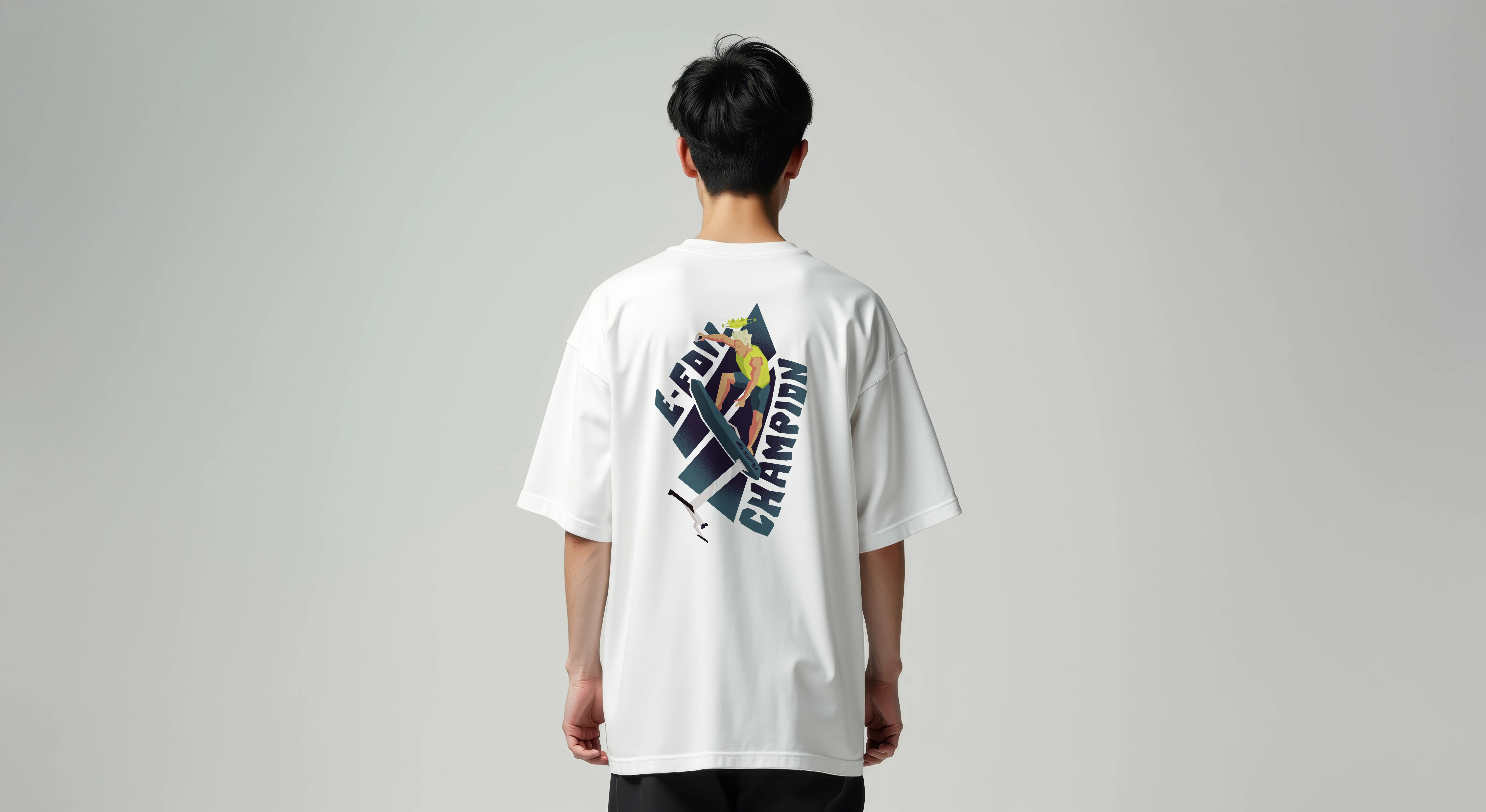
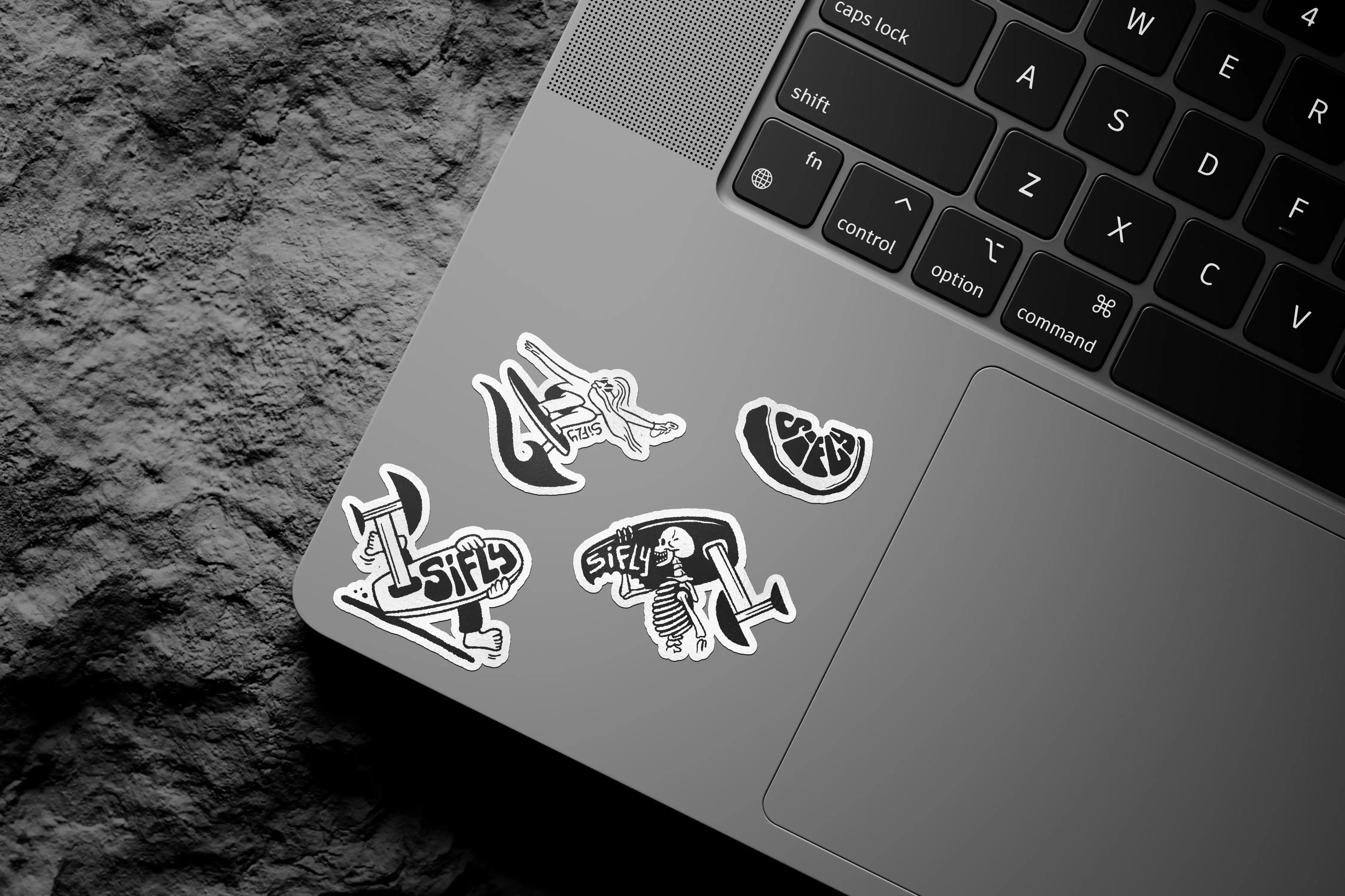
To bring a more personal and expressive layer to the brand, I regularly create custom illustrations for SiFly. These range from sticker packs and apparel graphics to social media content and campaign assets, extending the identity beyond the product itself.
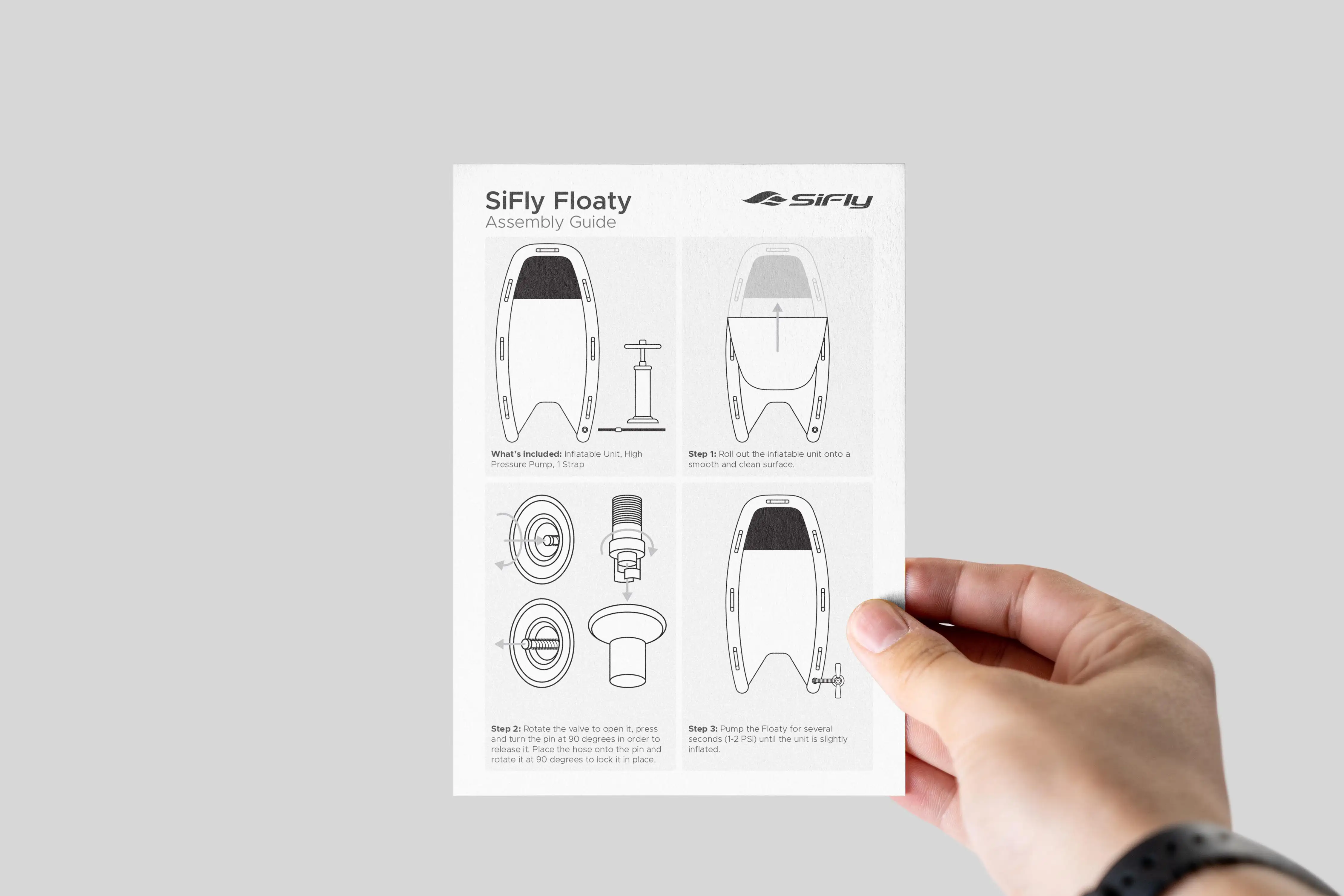
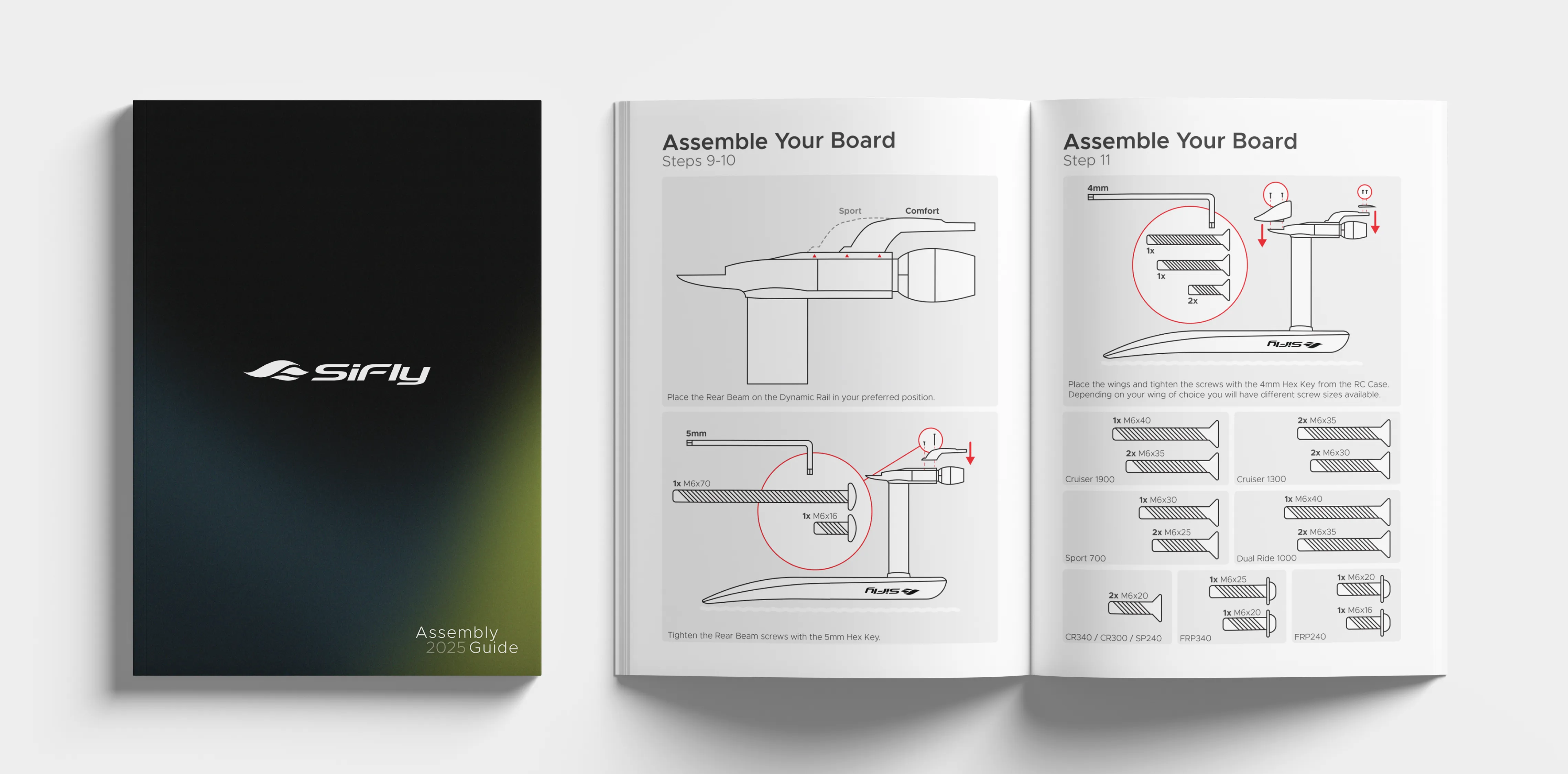
For technical documentation, including assembly guides and user manuals, I develop clear product illustrations that simplify complex information and improve usability.
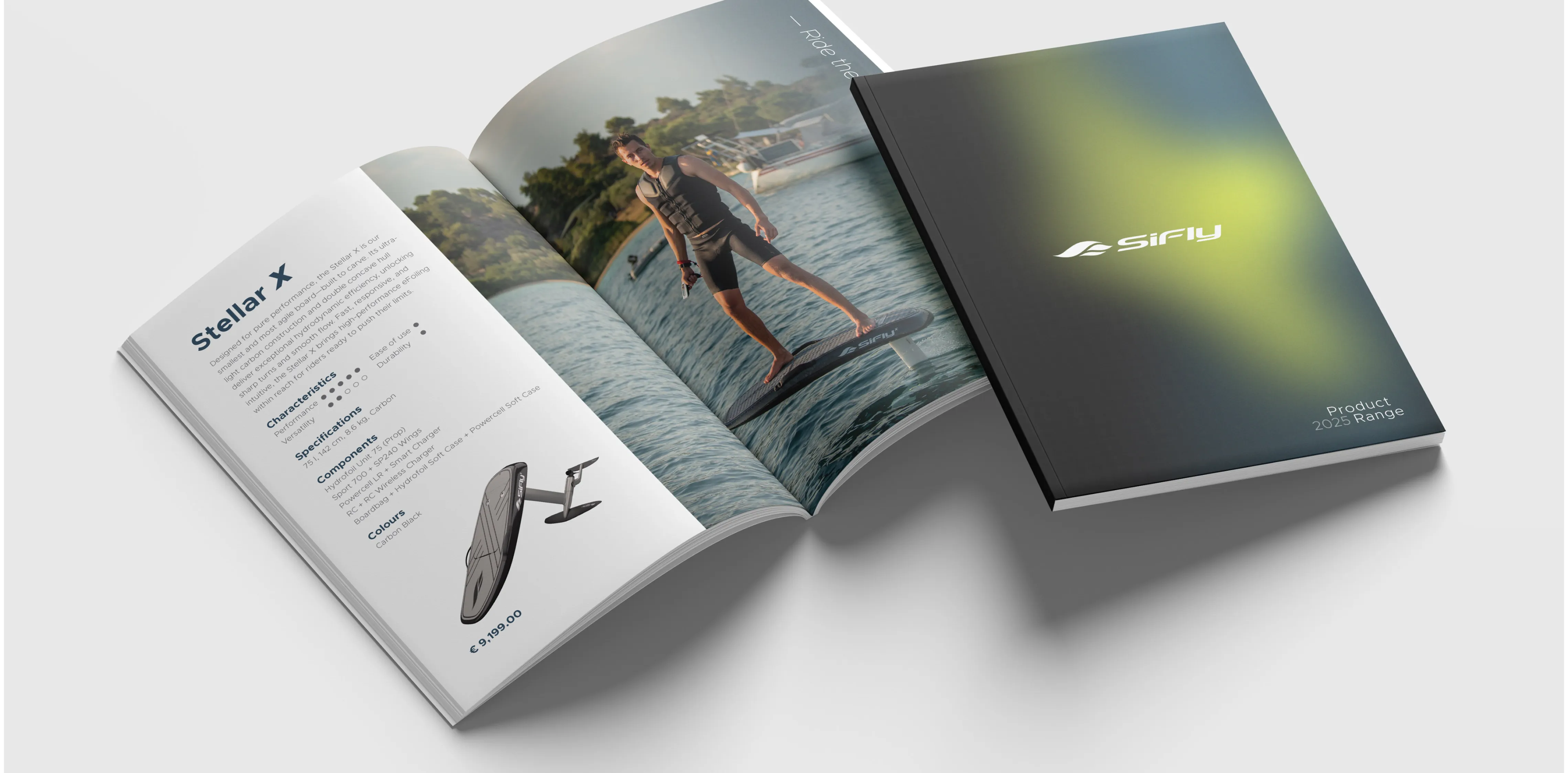
Brand Logic
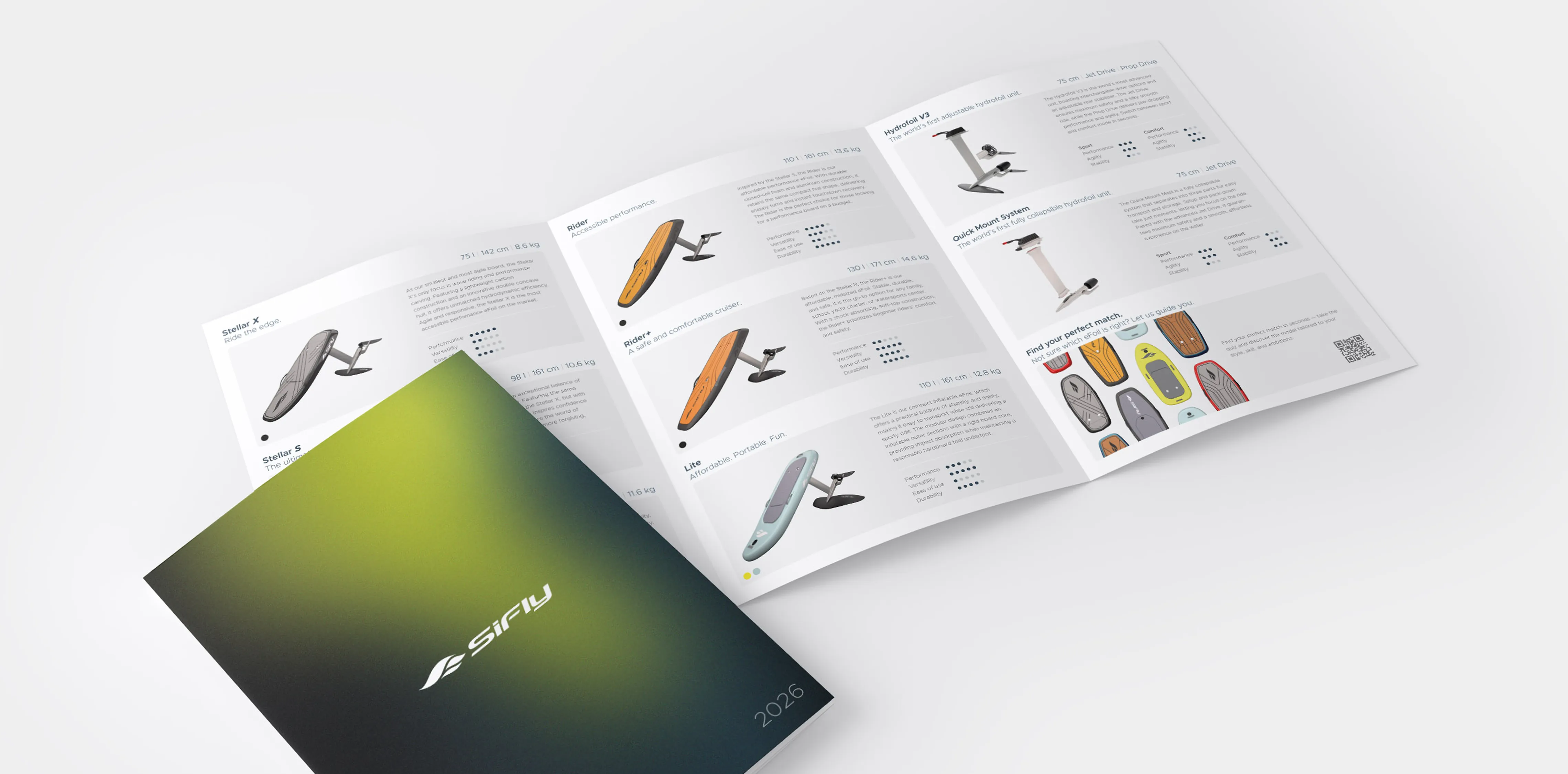
The visual system was designed to communicate motion, precision, and confidence. Typography plays a central role, with Metropolis selected for its strong legibility and contemporary technical character.
Color and gradients introduce a sense of movement and energy, while remaining structured enough to support usability across digital and physical applications. Together, these elements create a flexible visual language that remains consistent across marketing, product, and interface design.
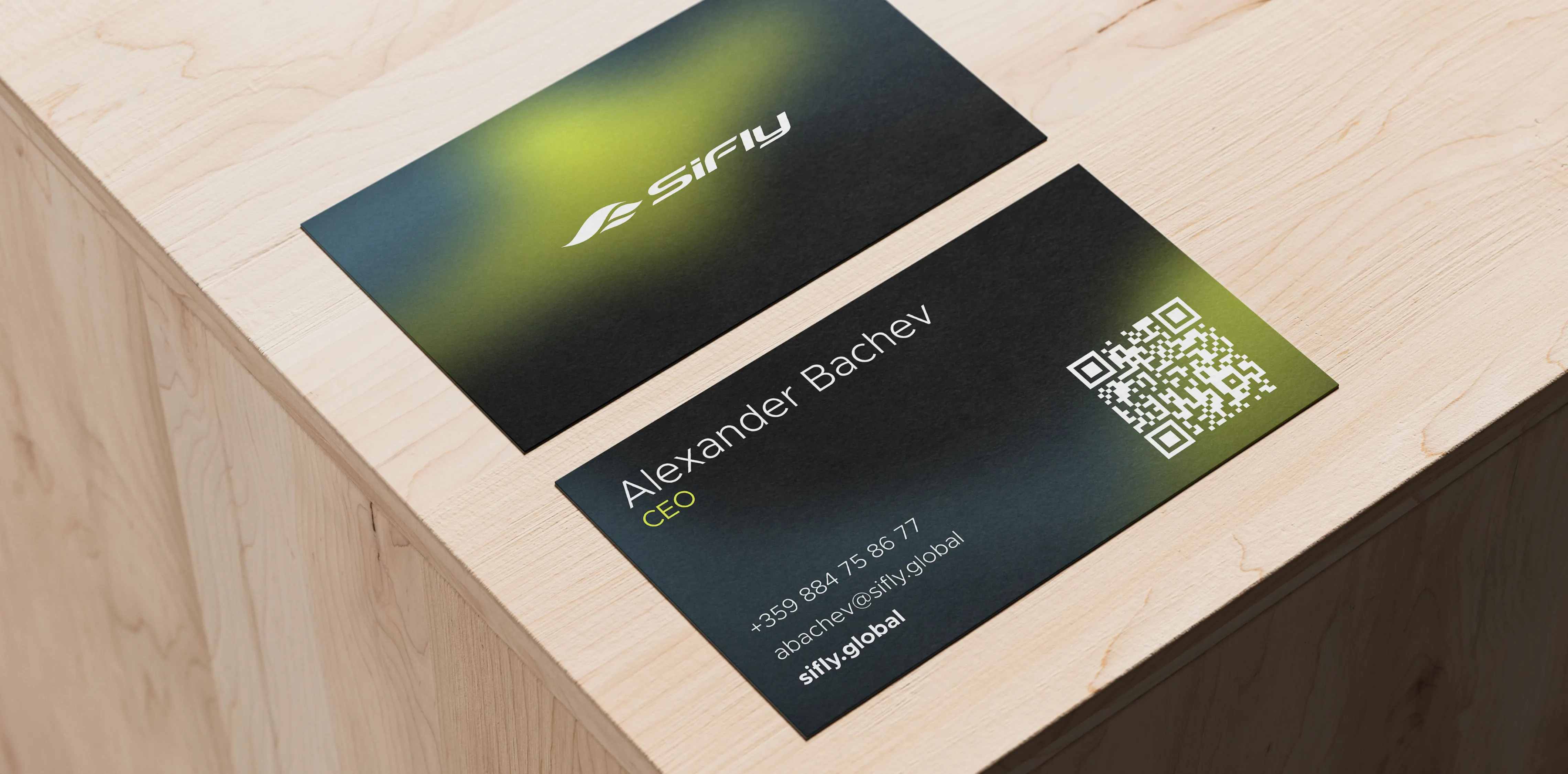
Impact
As SiFly's lead designer, I helped guide the evolution of the brand from an emerging European manufacturer to an internationally recognized eFoil company.
By establishing a consistent visual language across product, digital, and marketing channels, design became an integral part of the company's growth, strengthening both brand recognition and customer experience across global markets.
In Numbers
11%
Global Market Share Achieved
1,200+
Units Sold Annually Worldwide
3
Years Of Brand Guardianship
100%
Global Dealer Network Adoption