Umdenken
OVERVIEW
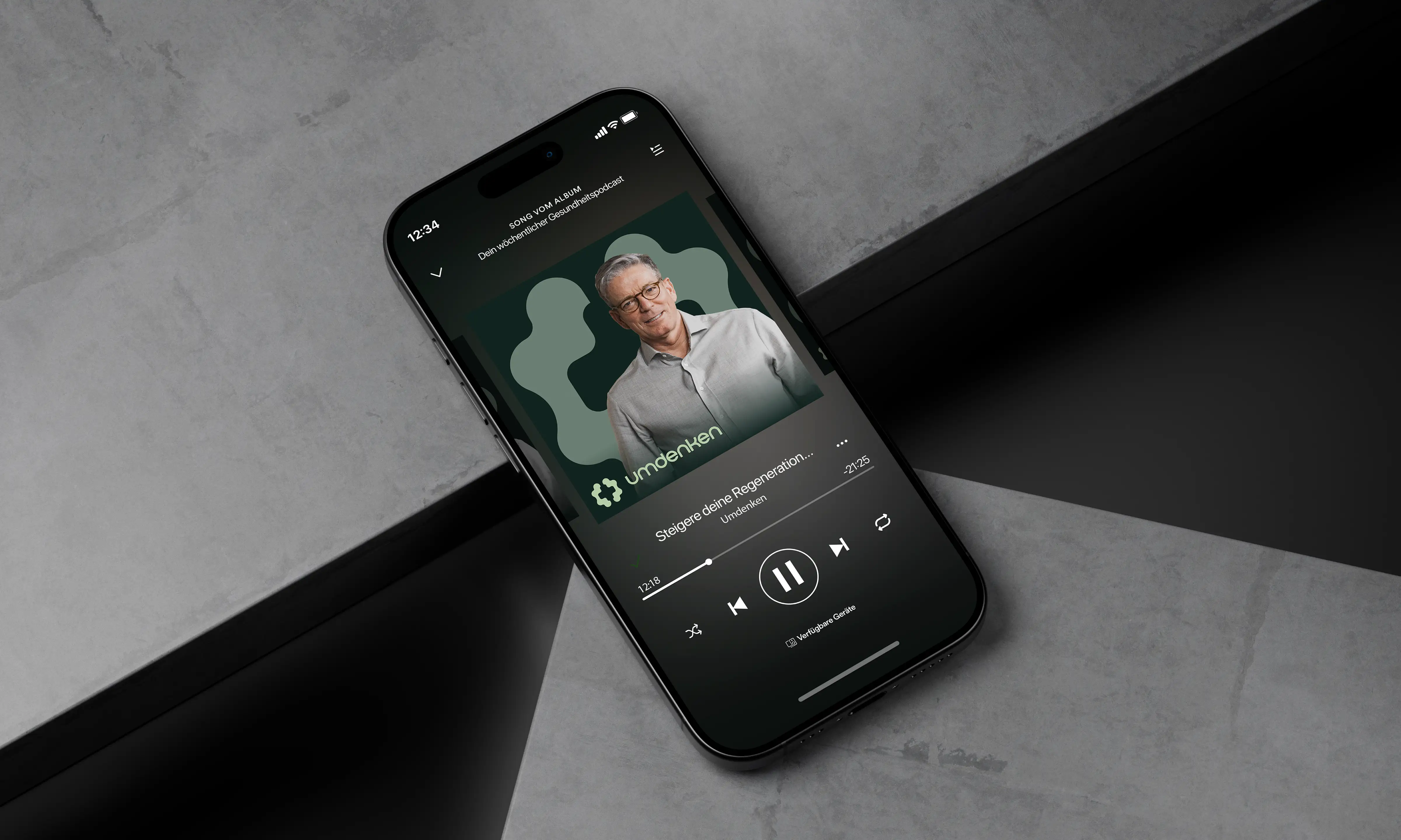
Umdenken is the rebranded identity of the former doc Buchhorn Podcast, created to reflect its broader focus on personal growth, leadership, and meaningful conversations. The project involved developing a new visual identity that moved beyond a personality-driven podcast and established a recognizable brand capable of growing across digital platforms.
CHALLENGE
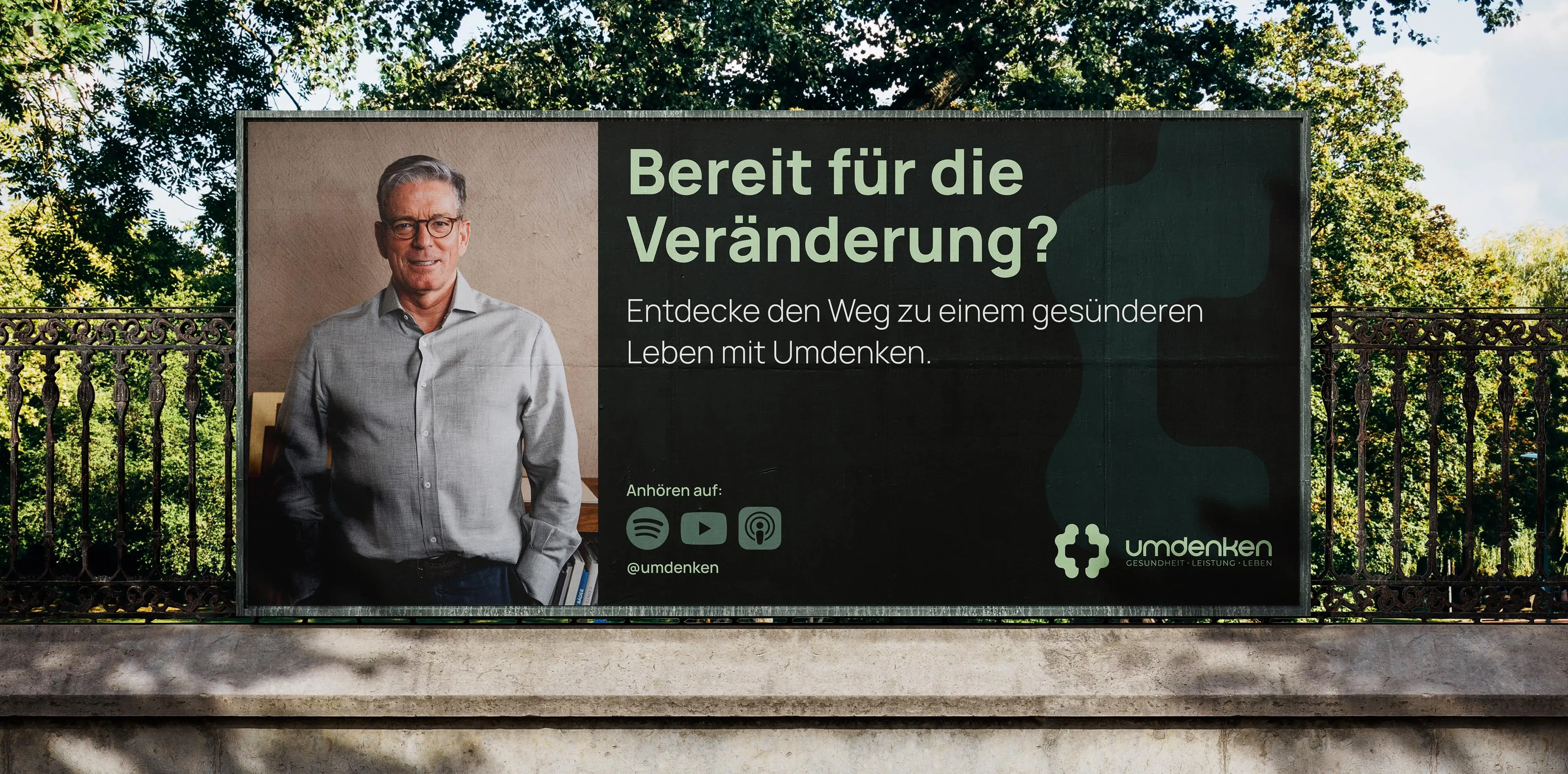
The existing identity was closely tied to the podcast's original name, limiting its ability to evolve into a broader platform. The challenge was to create a brand that felt thoughtful, contemporary, and approachable while communicating the idea of reflection, curiosity, and new perspectives.
The solution focused on simplicity, allowing typography, colour, and composition to create a calm and recognizable identity without relying on unnecessary visual complexity.
IDENTITY CONCEPT
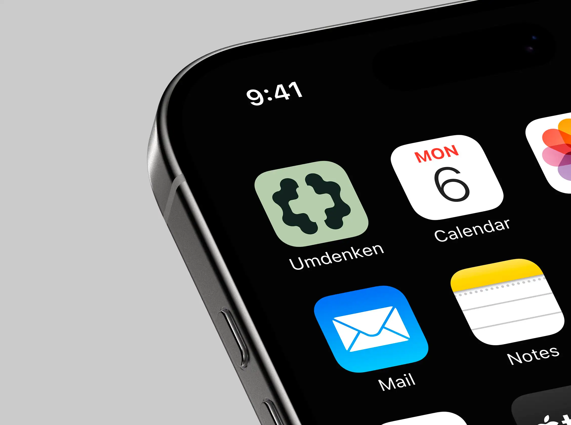
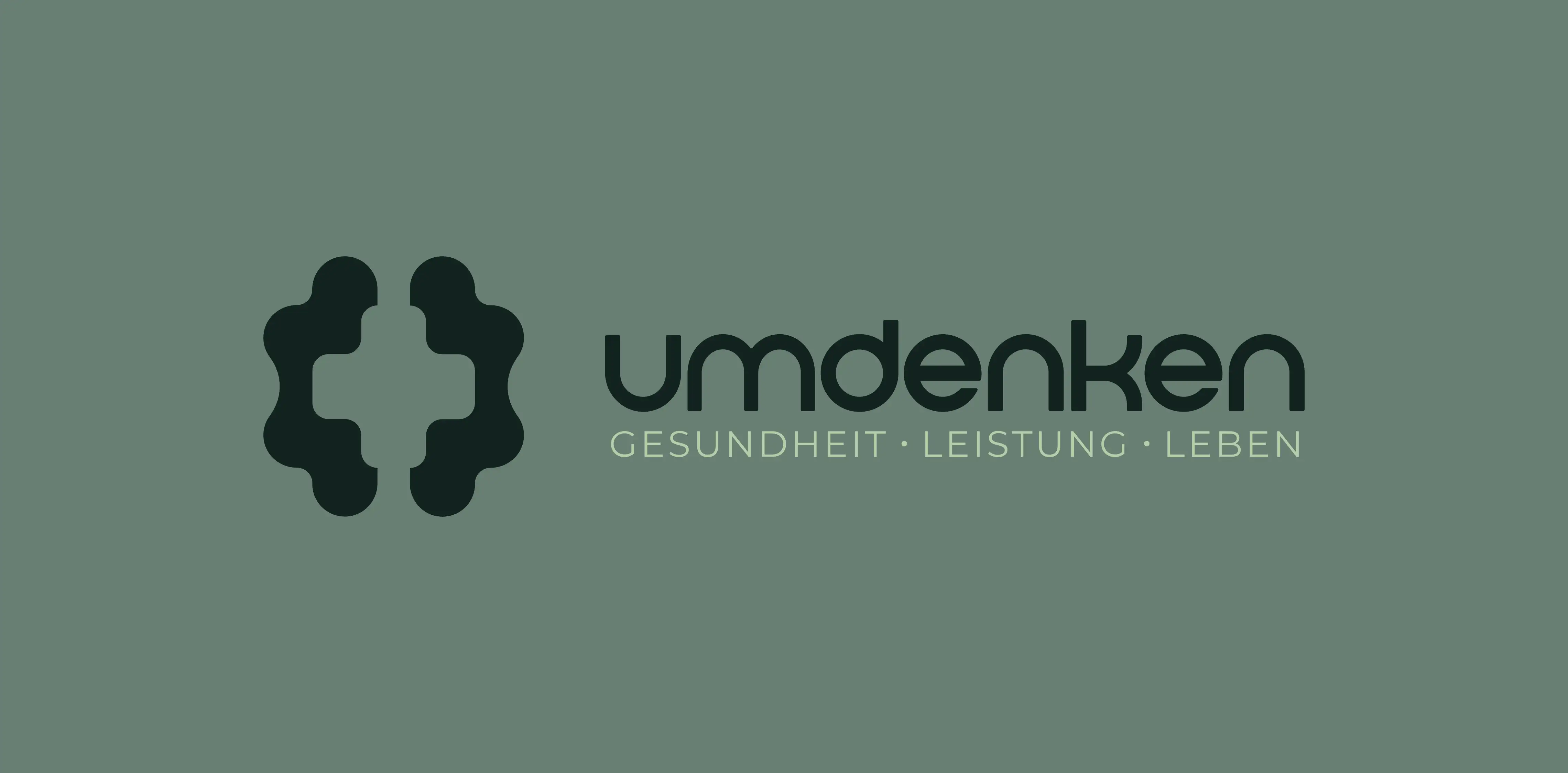
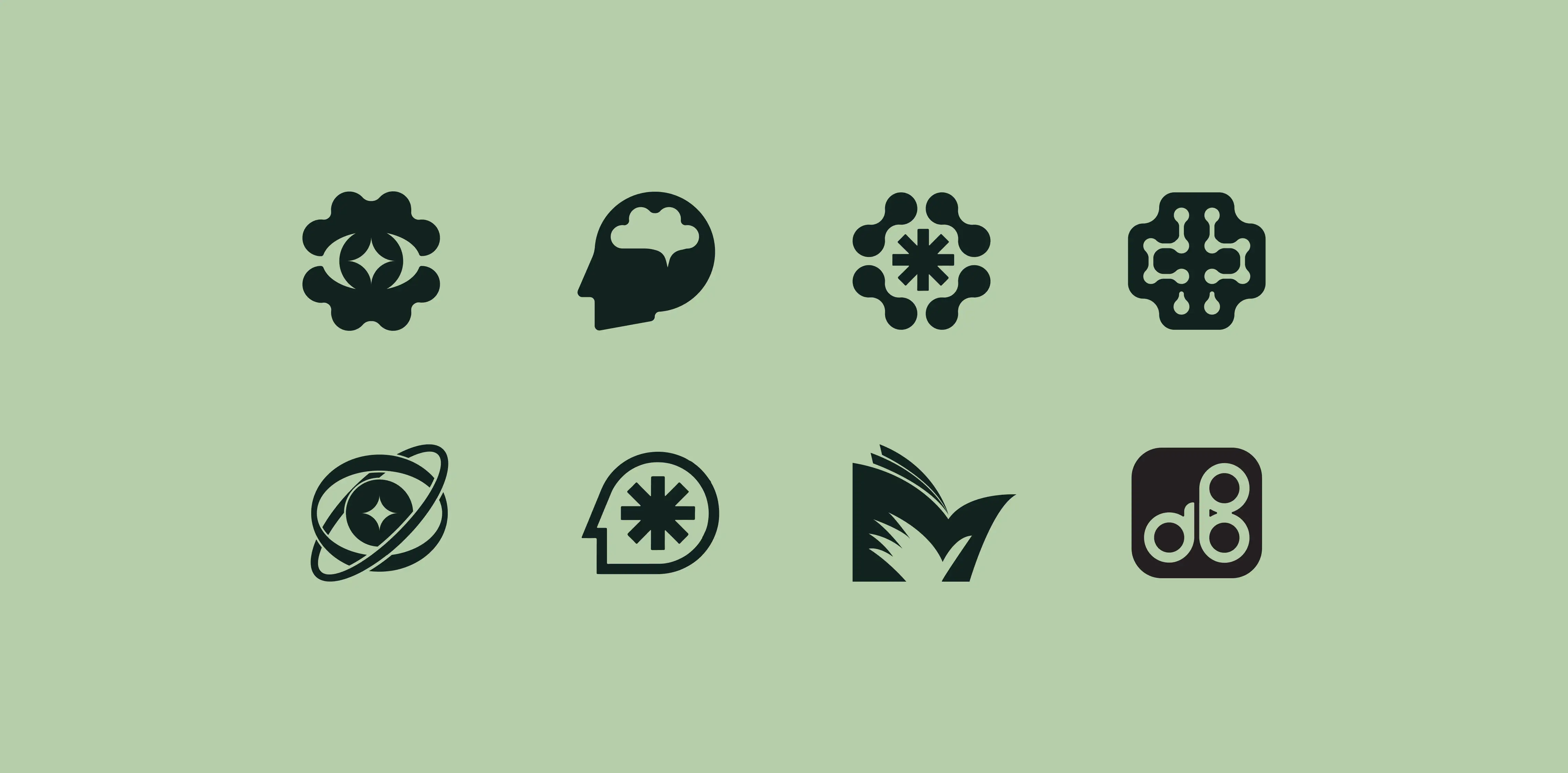
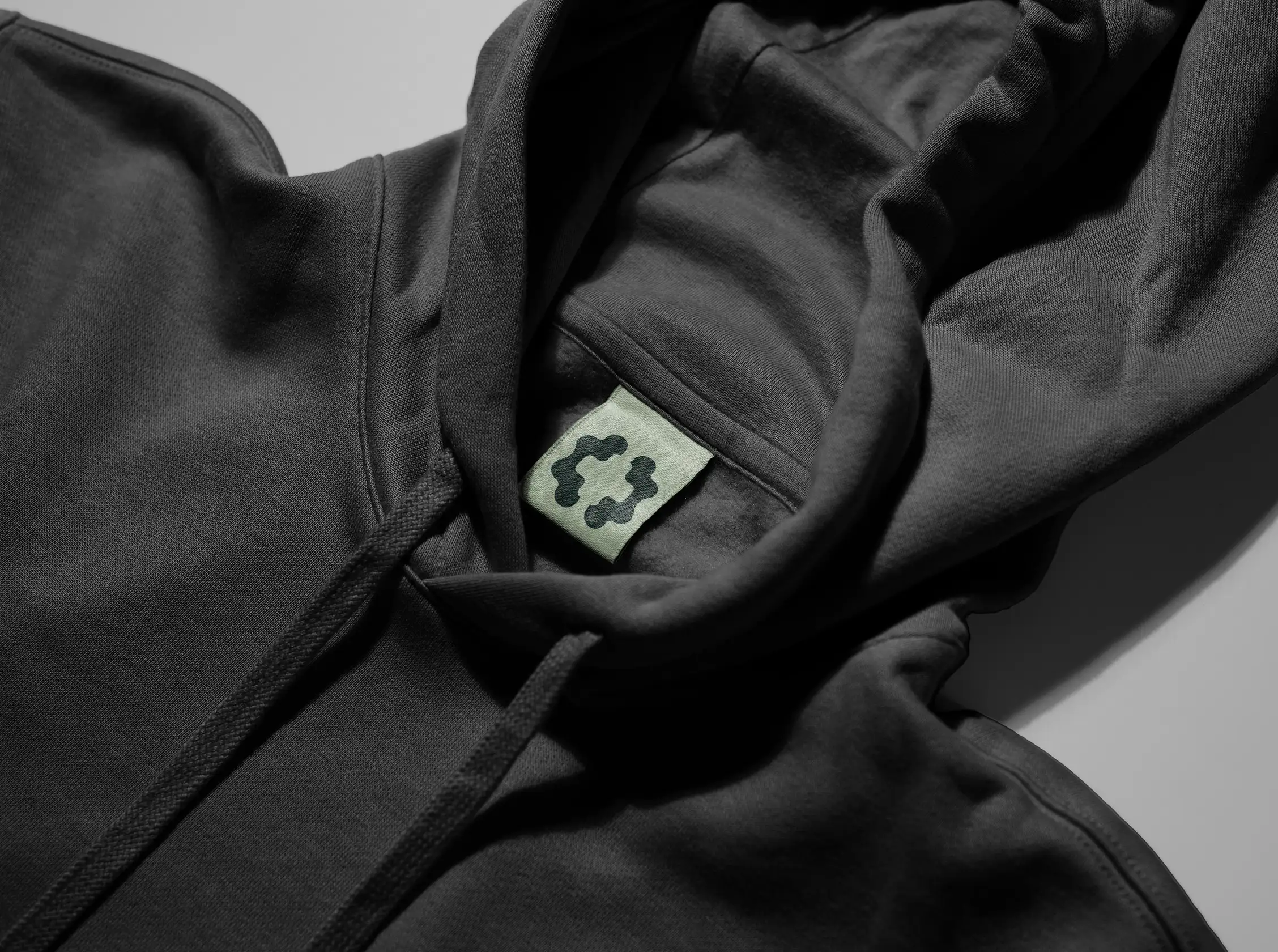
The identity is centered around a custom symbol designed to express the essence of Umdenken: the act of rethinking and seeing things from a different perspective. The icon combines the abstract form of a human brain with a medical cross revealed through the negative space, connecting the podcast's roots in healthcare with its broader focus on reflection, learning, and personal development.
Complementing the symbol is a bespoke geometric wordmark developed specifically for the project. Its clean proportions and restrained character create a natural extension of the icon, resulting in a cohesive identity that feels modern, approachable, and built for long-term recognition.
VISUAL IDENTITY
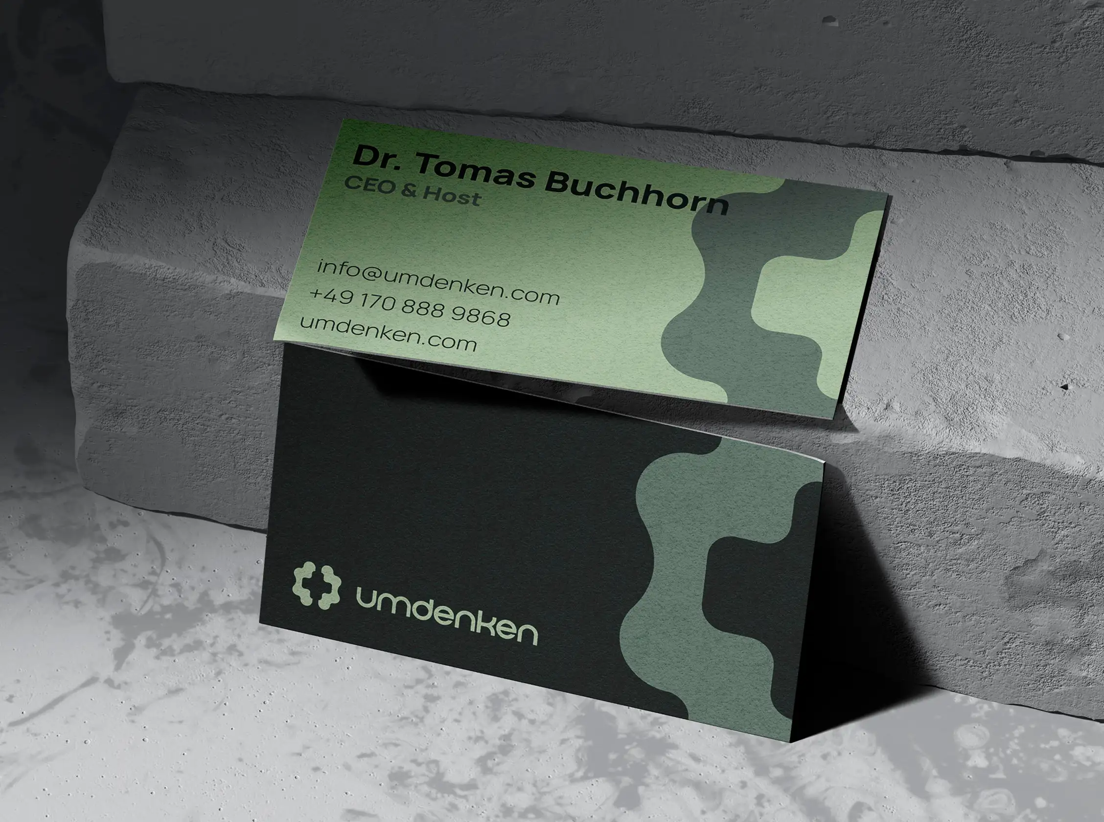
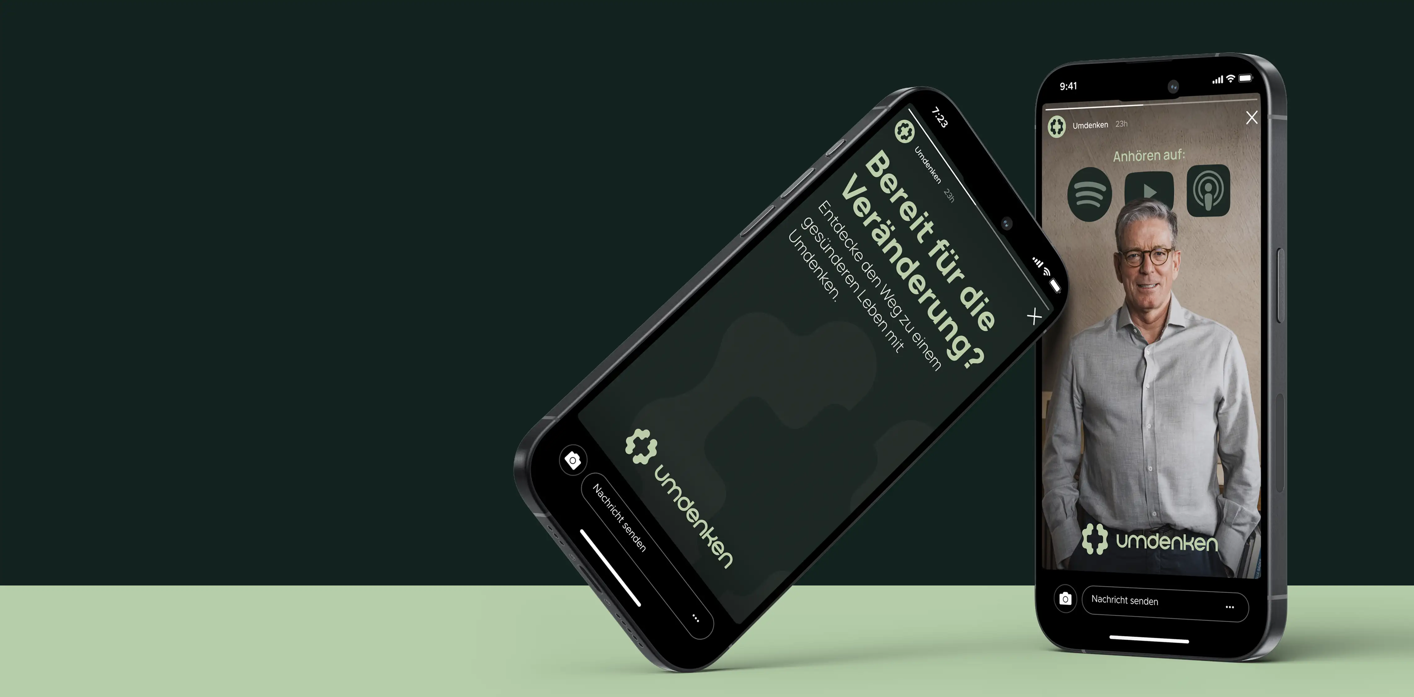
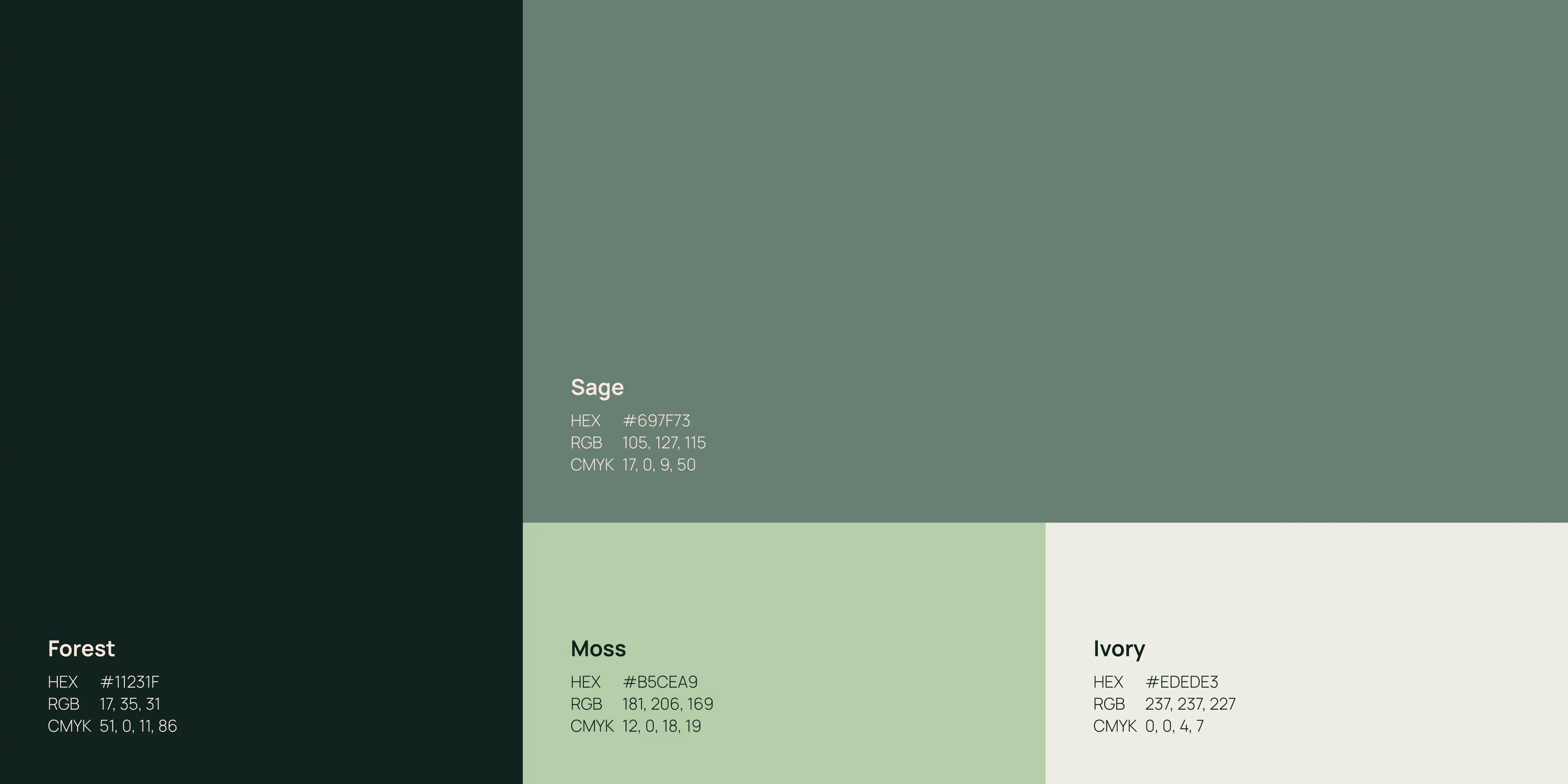
The identity is built around a restrained visual language that reflects the tone of the conversations themselves. A muted natural colour palette, clean typography, and generous use of whitespace create a sense of clarity and balance, allowing the content to remain the primary focus.
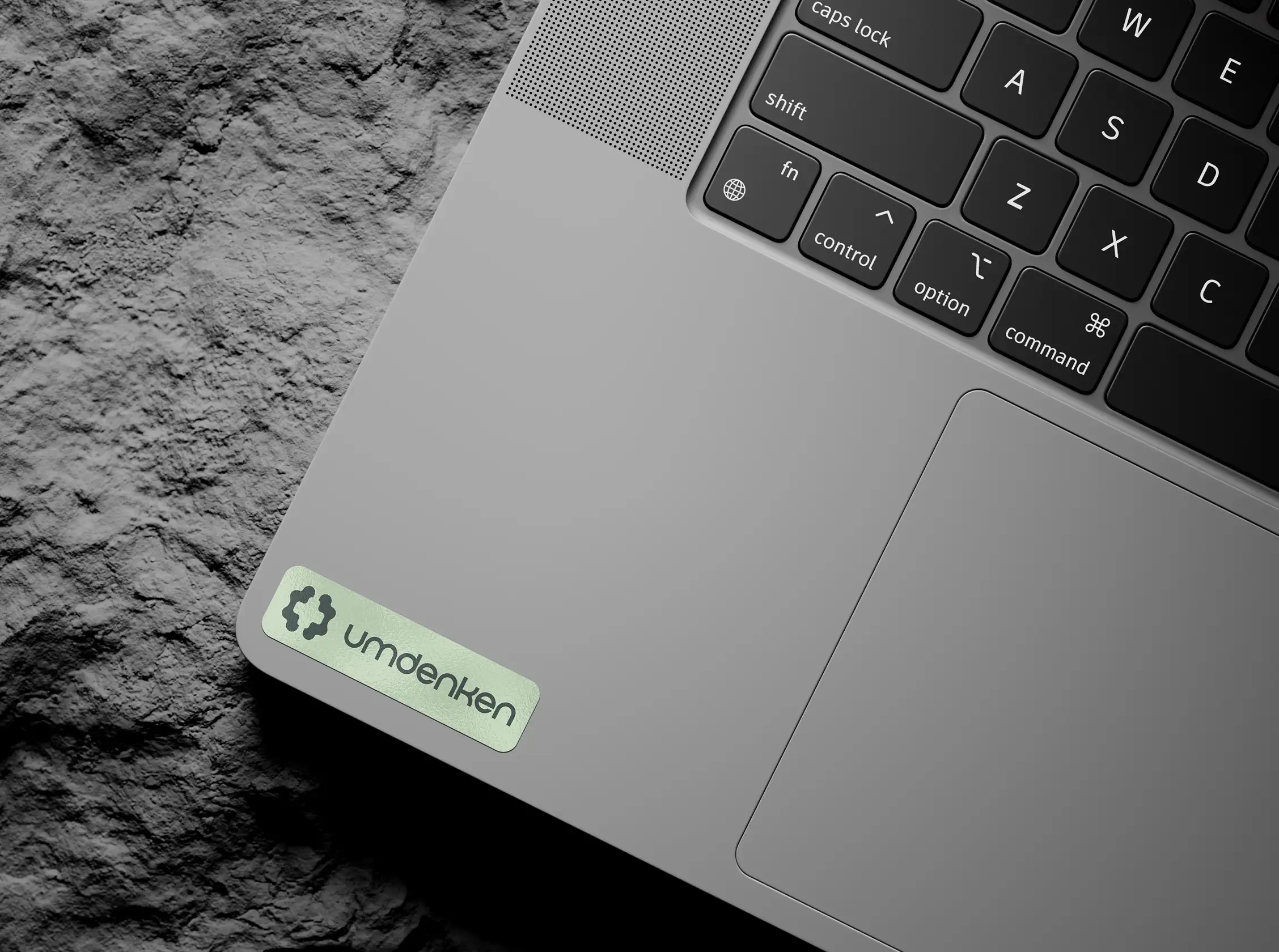
The custom wordmark reinforces this direction through subtle refinements that give the brand a distinctive yet understated character across digital and print applications.
Visual Language
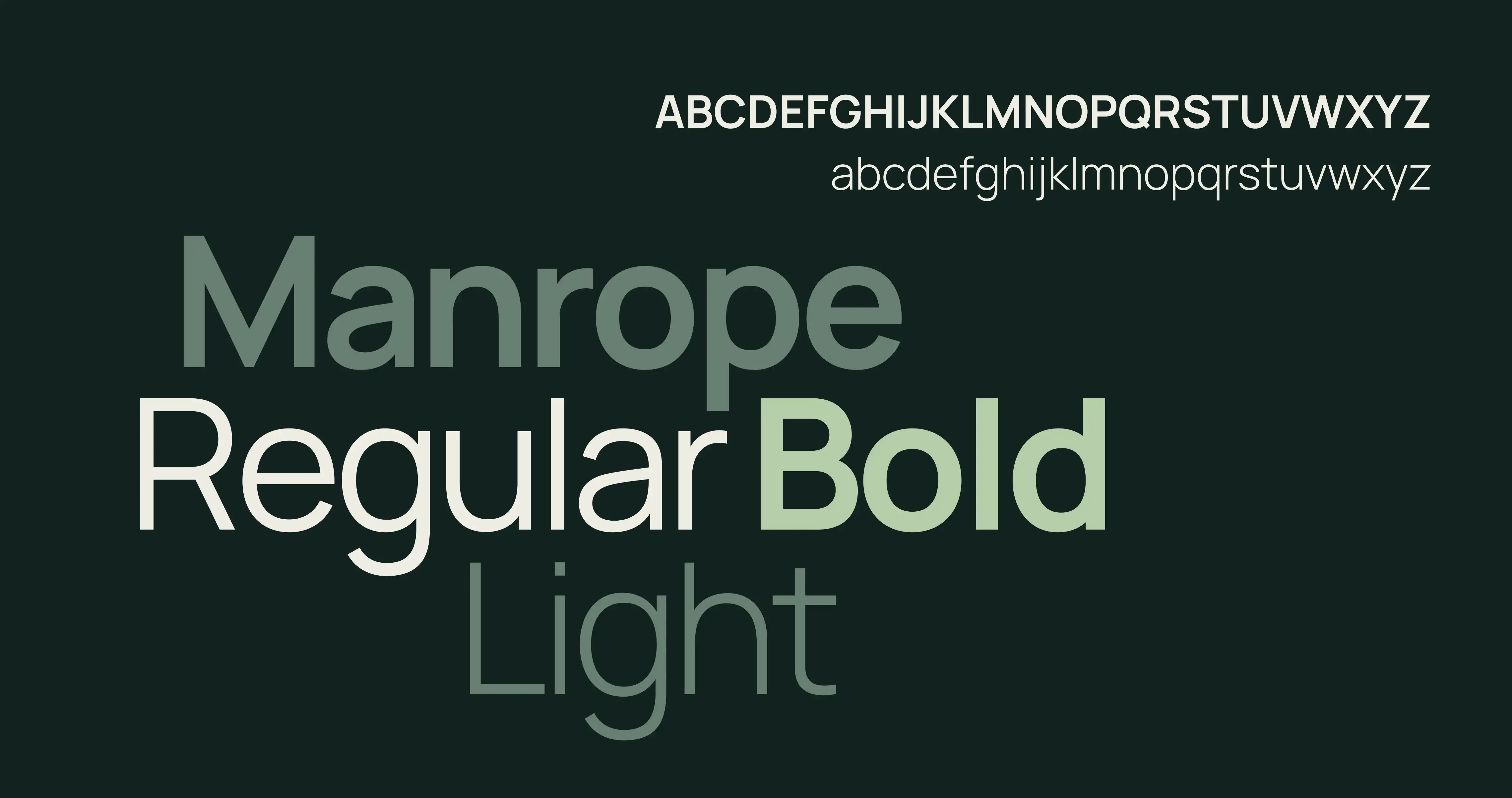
The visual system was designed to remain flexible across podcast artwork, social media, presentation materials, and future brand extensions. Manrope provides a contemporary typographic foundation, while the earthy colour palette introduces warmth and approachability without sacrificing professionalism.
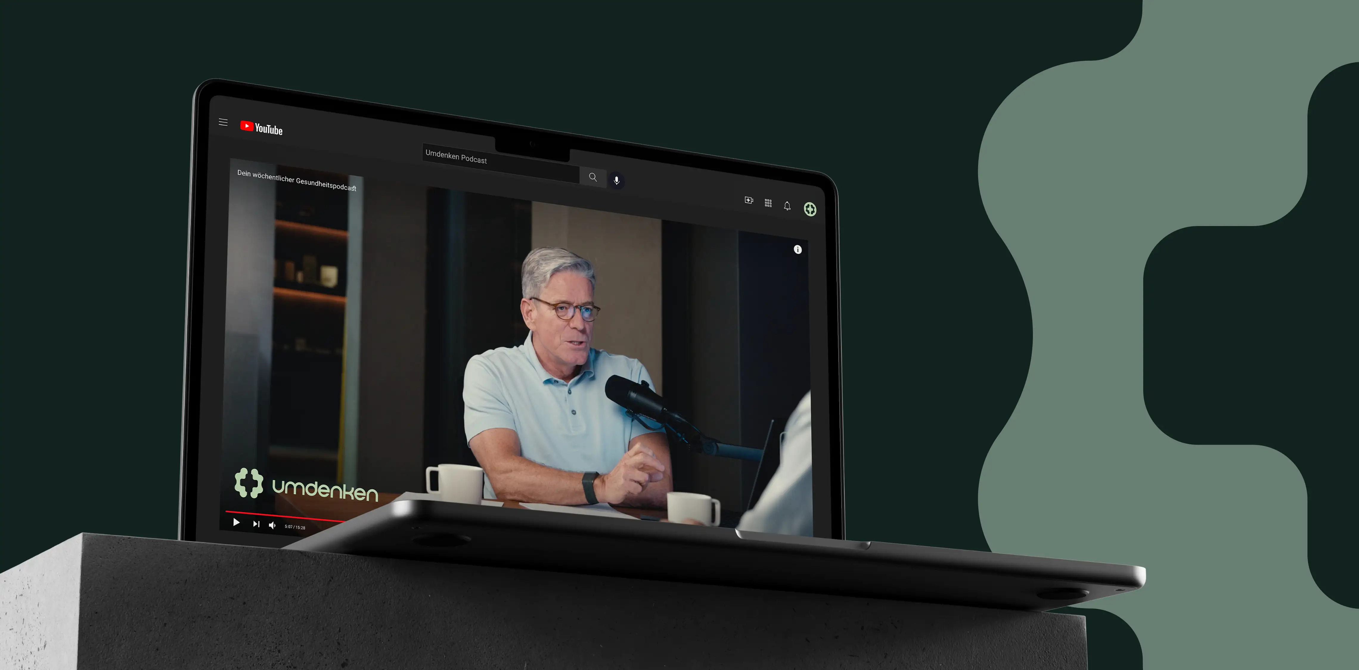
Together, these elements establish a consistent identity that supports the podcast's transition into a broader platform for ideas and discussion.
IMPACT
The rebrand provides Umdenken with a clear and adaptable visual identity that supports its evolving vision. By shifting the focus from an individual podcast to a broader brand, the new identity creates a stronger foundation for future content, collaborations, and audience growth.